Anchorline Partners | Lowell, MA
Connecting the Campus Dots
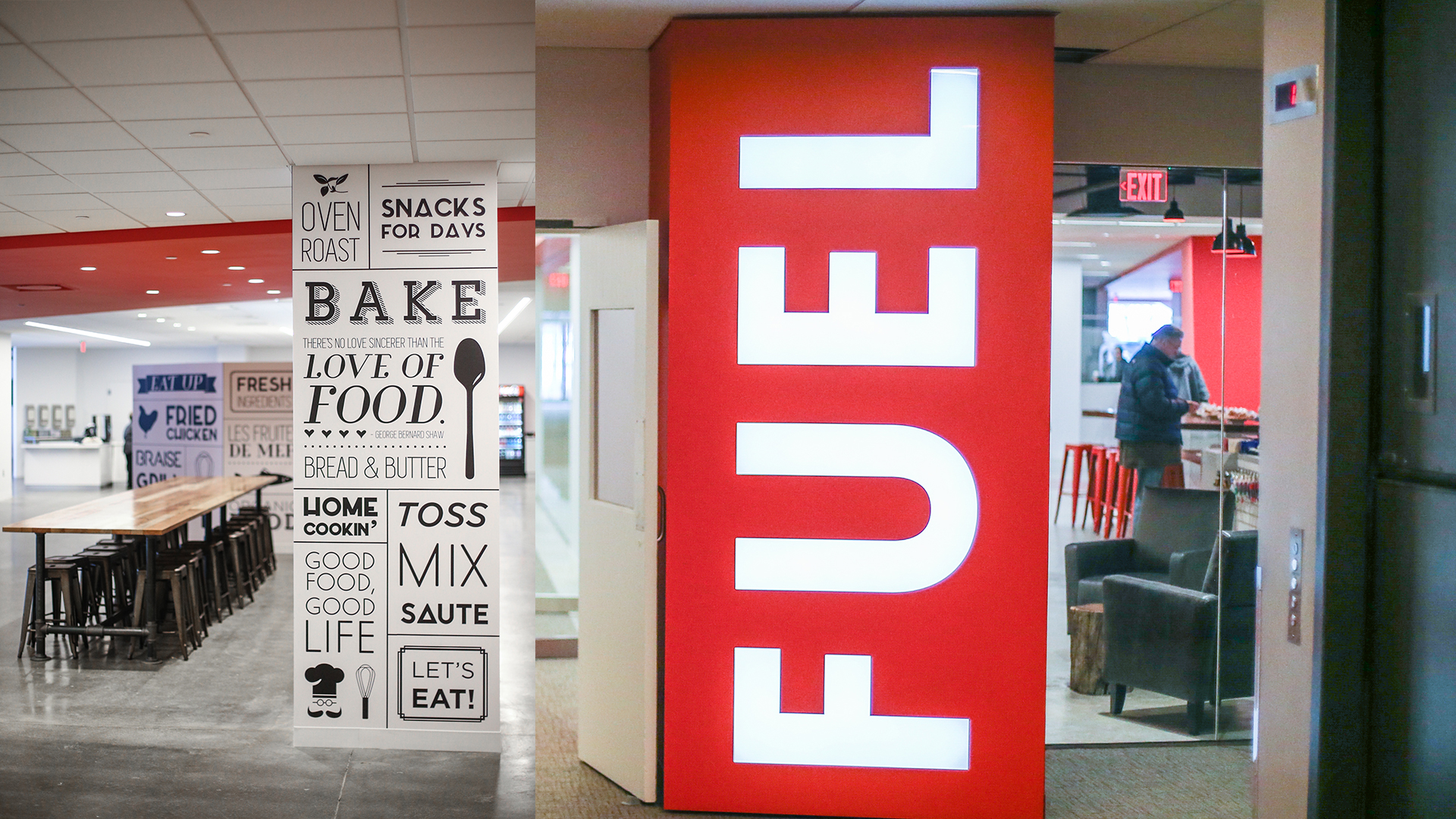
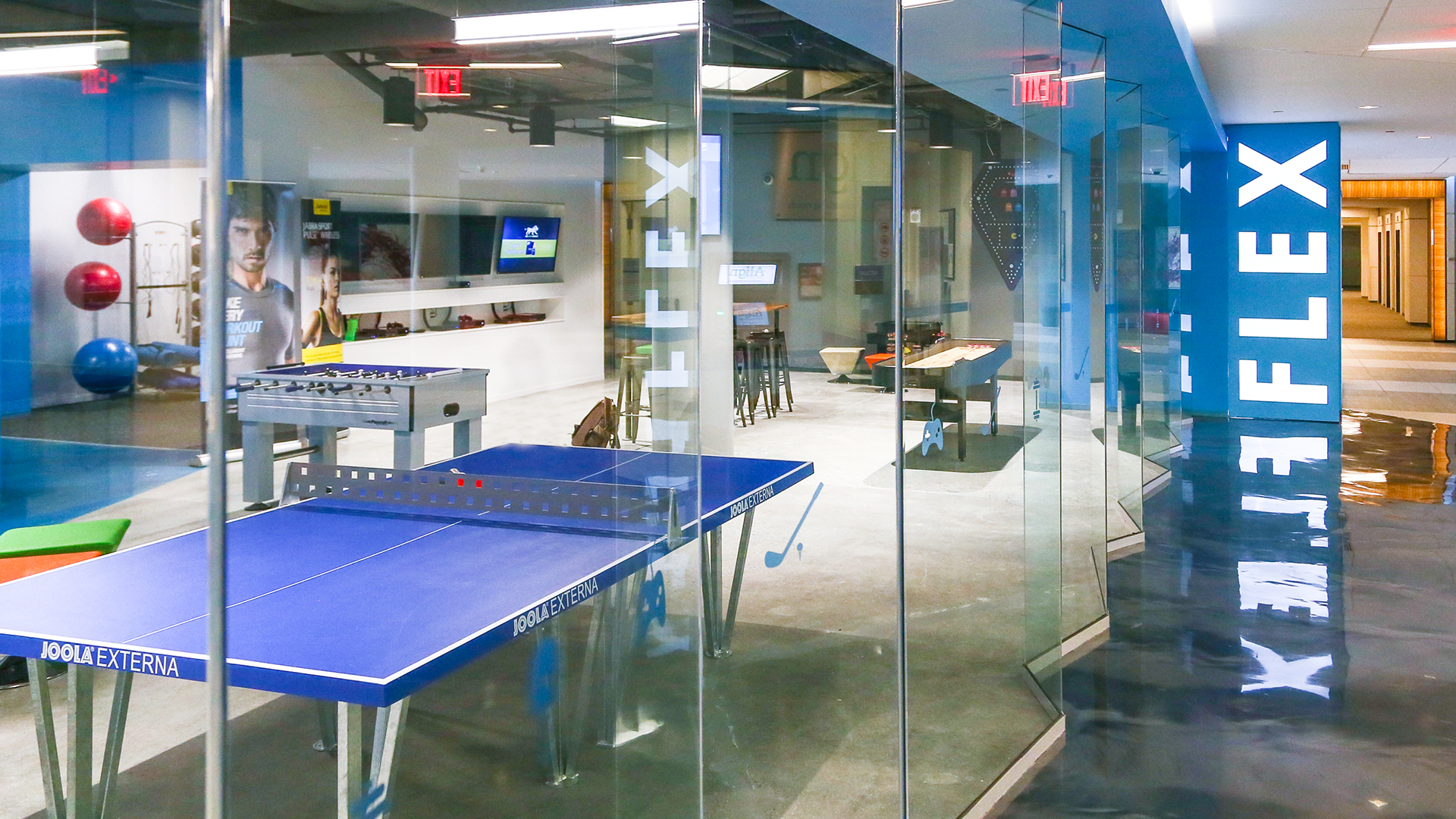
Starting with the brand strategy and repositioning of Cross Point, LLM developed a dynamic experience from outside to inside. Whether it’s the bold exterior signage, large social spot of Fuel, the rowdy game room of Flex, or the contemplative benches in the thoroughfare, Cross Point is most definitely a campus for the next generation. Within 6 months of renovations being completed, Kronos chose Cross Point as its new HQ, leasing over 435,000 SF.
Insight
Architecture, Interior Design, Brand Strategy and Identity, Environmental Graphics, Signage, Wayfinding, Film and Photography, Events, E-Blasts, Website, Marketing Center
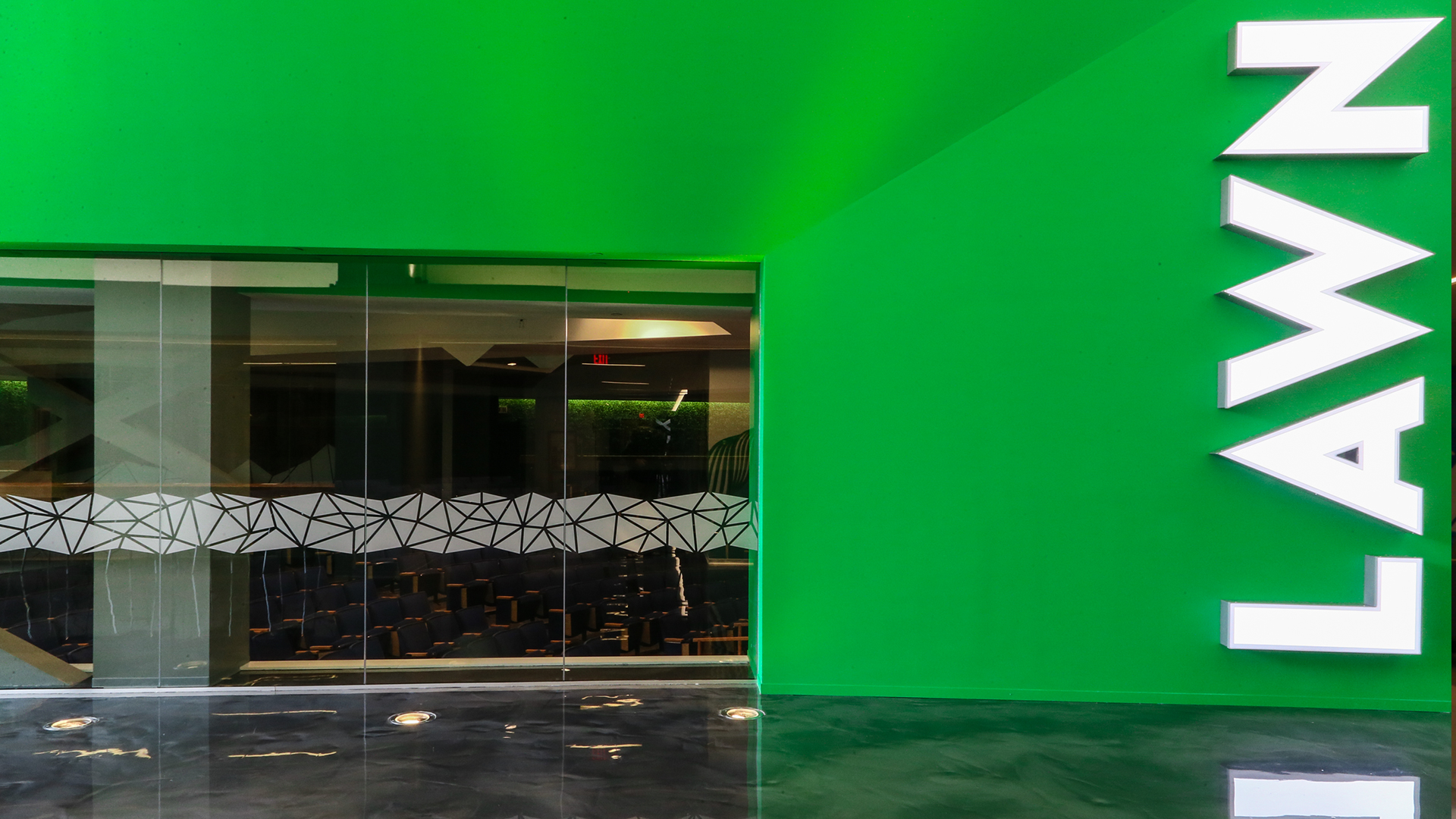
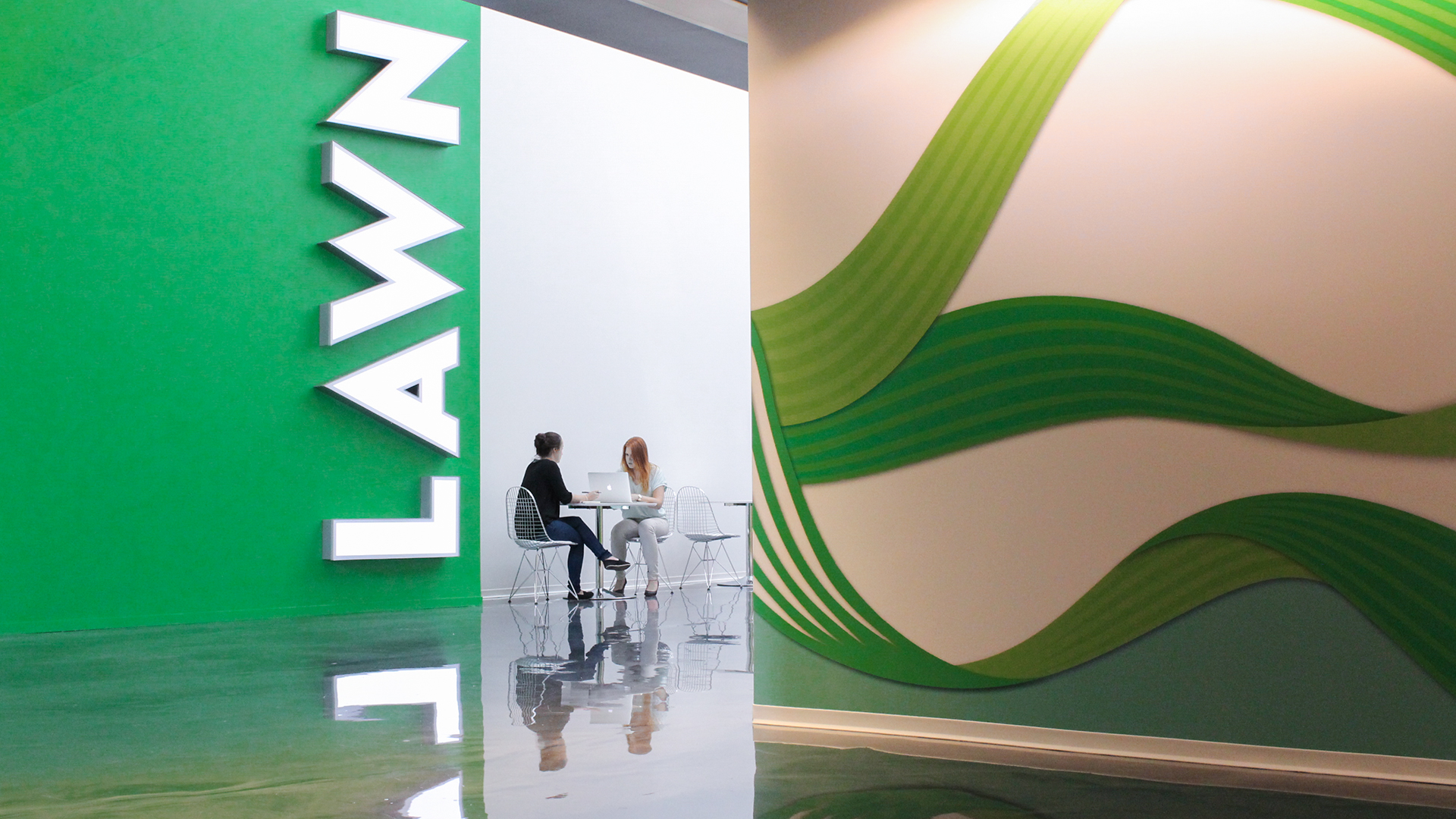
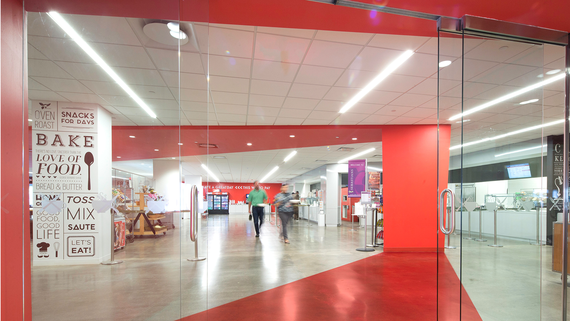
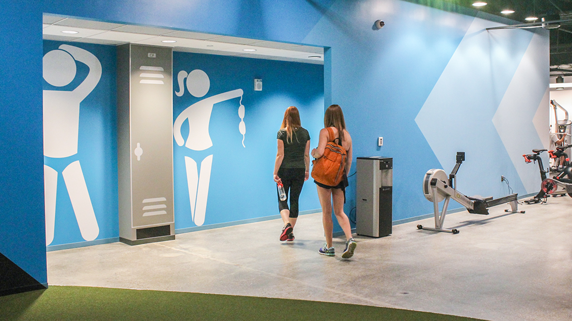
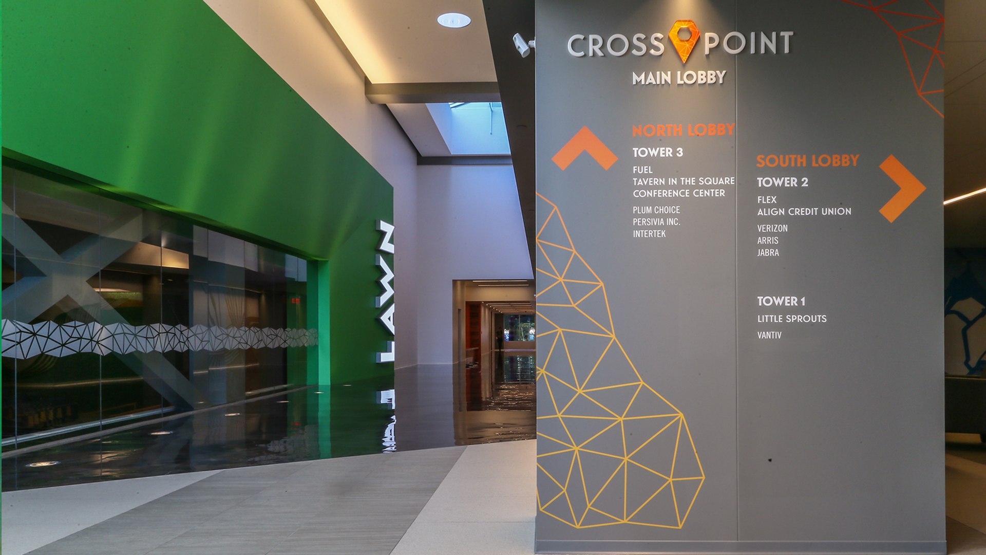
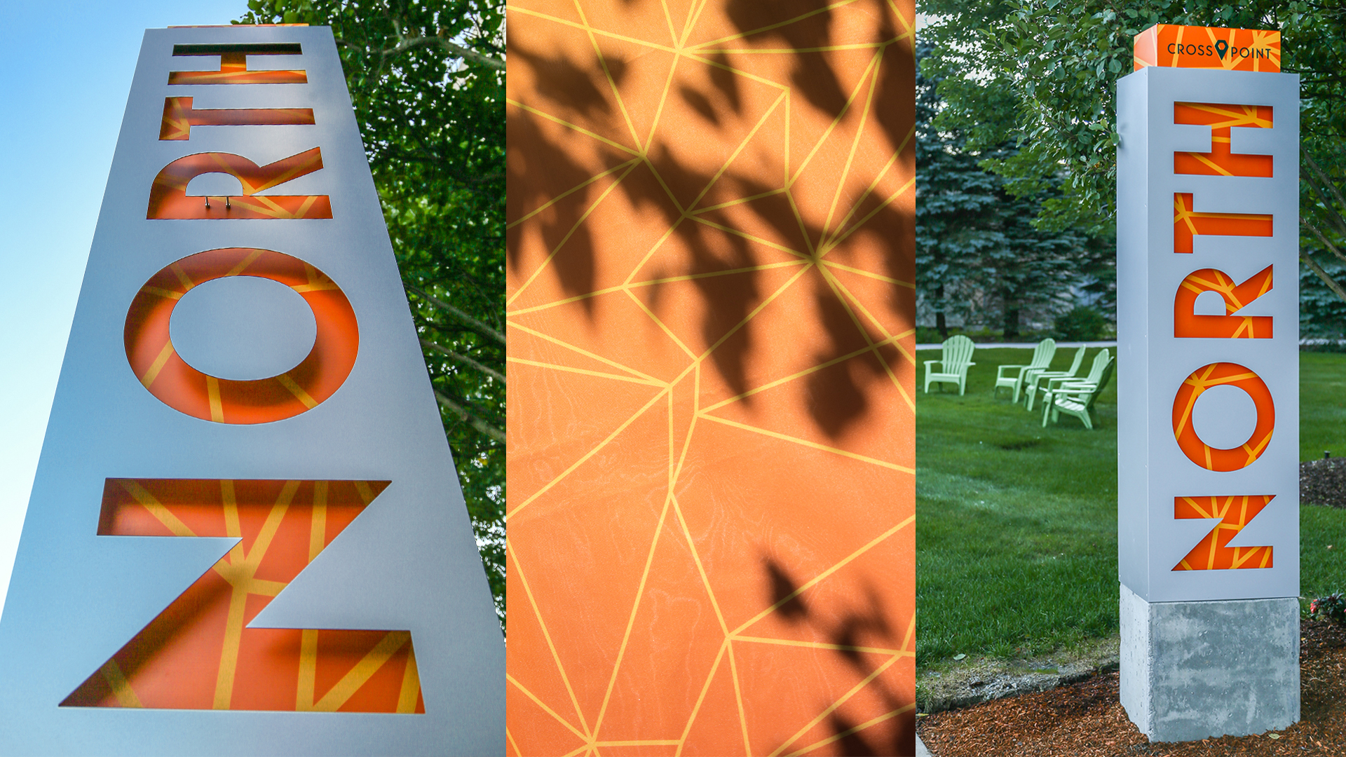
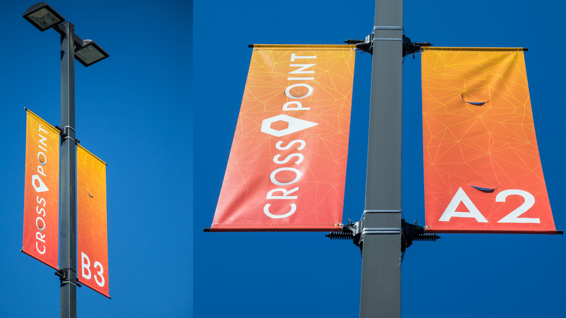
Cross Point, a campus of three connected towers that provide 1.25 million SF, focuses on tenant amenities and shared spaces to create a unique and inviting campus. We renamed these spaces Flex, Fuel, and Lawn and used a strong wayfinding system of back-lit signs and color codes to design and connect these vibrant and uniquely inspiring spaces.
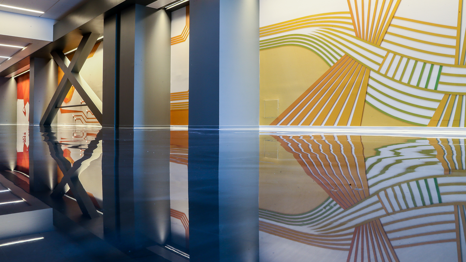
We wanted to infuse the design with elements of Lowell’s history wherever it made aesthetic sense. On one of the long connecting walls, for instance, we created a custom graphic that depicts the progression of an intricate pattern of waterways in a nod to the city’s role in the mill industry. Café Kerouac is a coffee bar inspired by the Lowell native and famous writer, Jack Kerouac. Inspiring quotes from the author, along with original iconic illustrations printed on wallpaper bring a sophisticated look to what could have been a mundane coffee bar. The pub area at Fuel is set apart instantly by the large sports figures; an ode to Boston sports teams. Micky Ward stands tallest in printed vinyl as Lowell’s local hero. His statistics as a boxer were applied to the adjacent wall in a glossy cut vinyl, highlighting his accomplishments.
Anchor Line Partners, CBRE, Boston Building Wraps
Branded Interior Spaces
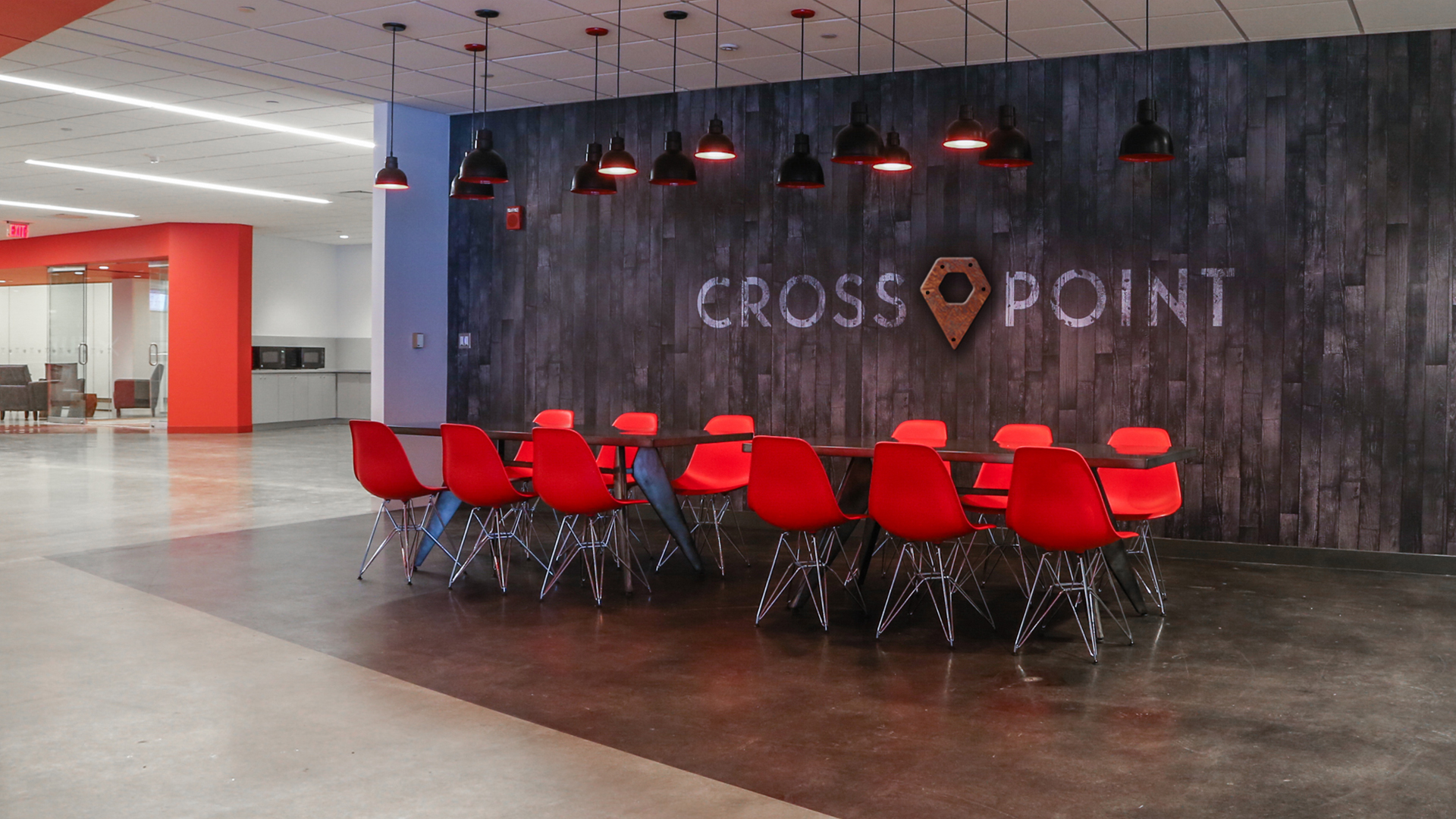
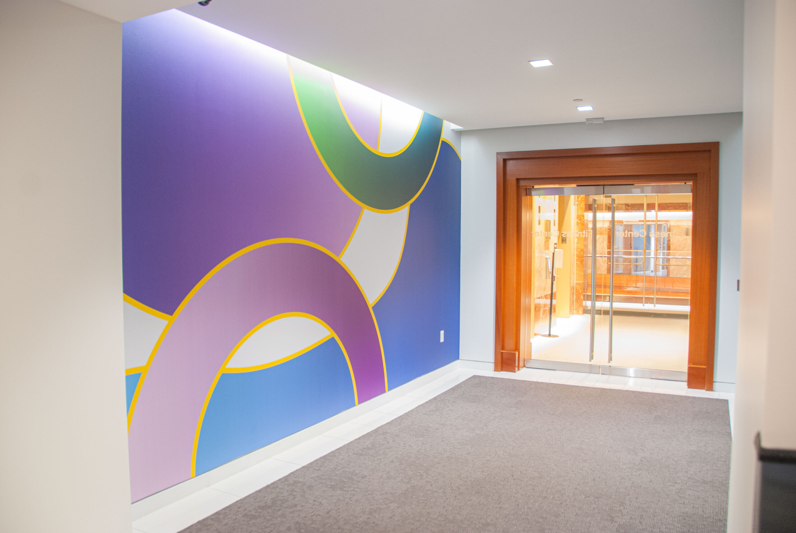
The brand concept was developed to inspire creativity by designing interesting, unique common spaces available to all. Creative direction is a mix of distressed vintage (borrowing from the local mill aesthetic) and clean modern, with bold graphics that engage visitors from the very beginning of their journey through Cross Point.
Exterior Signage
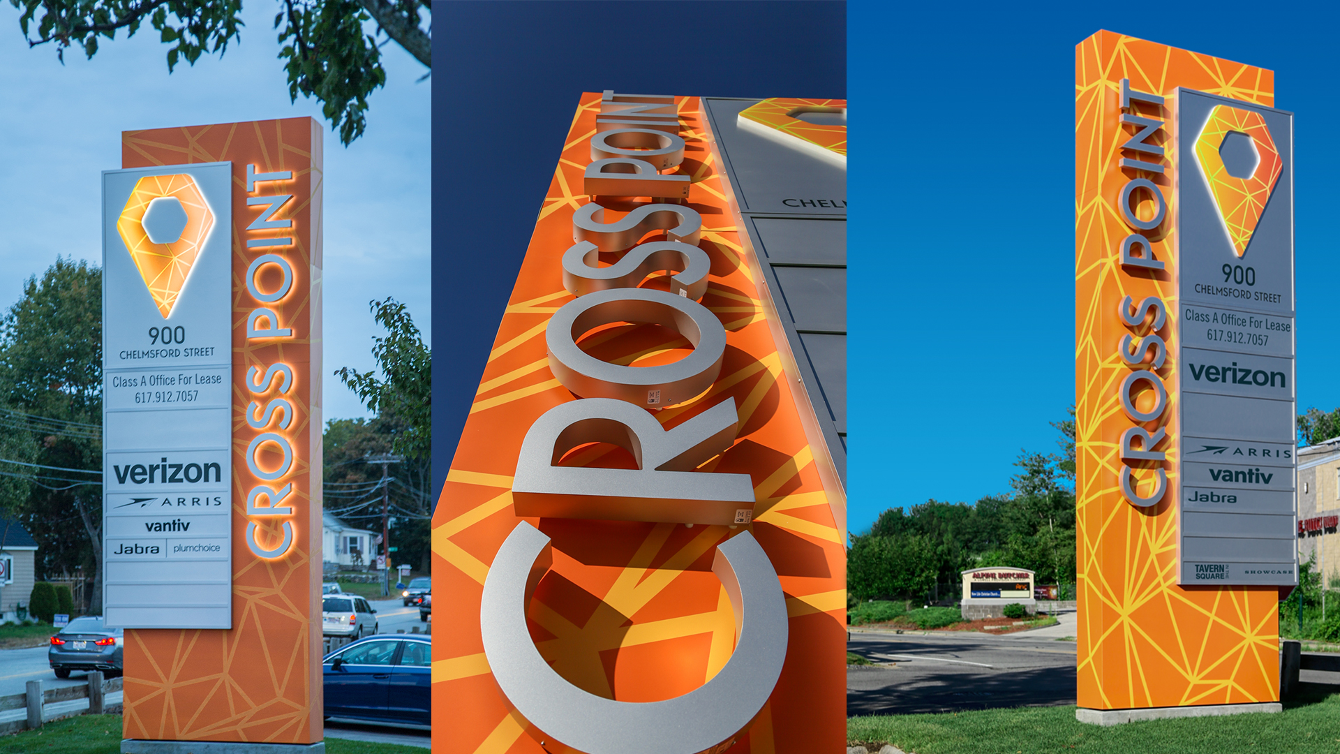
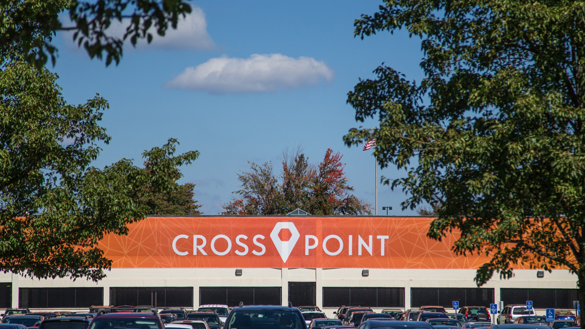
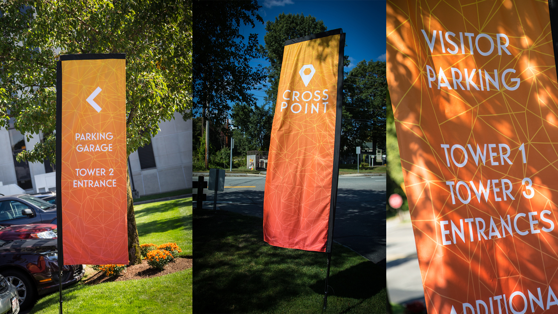
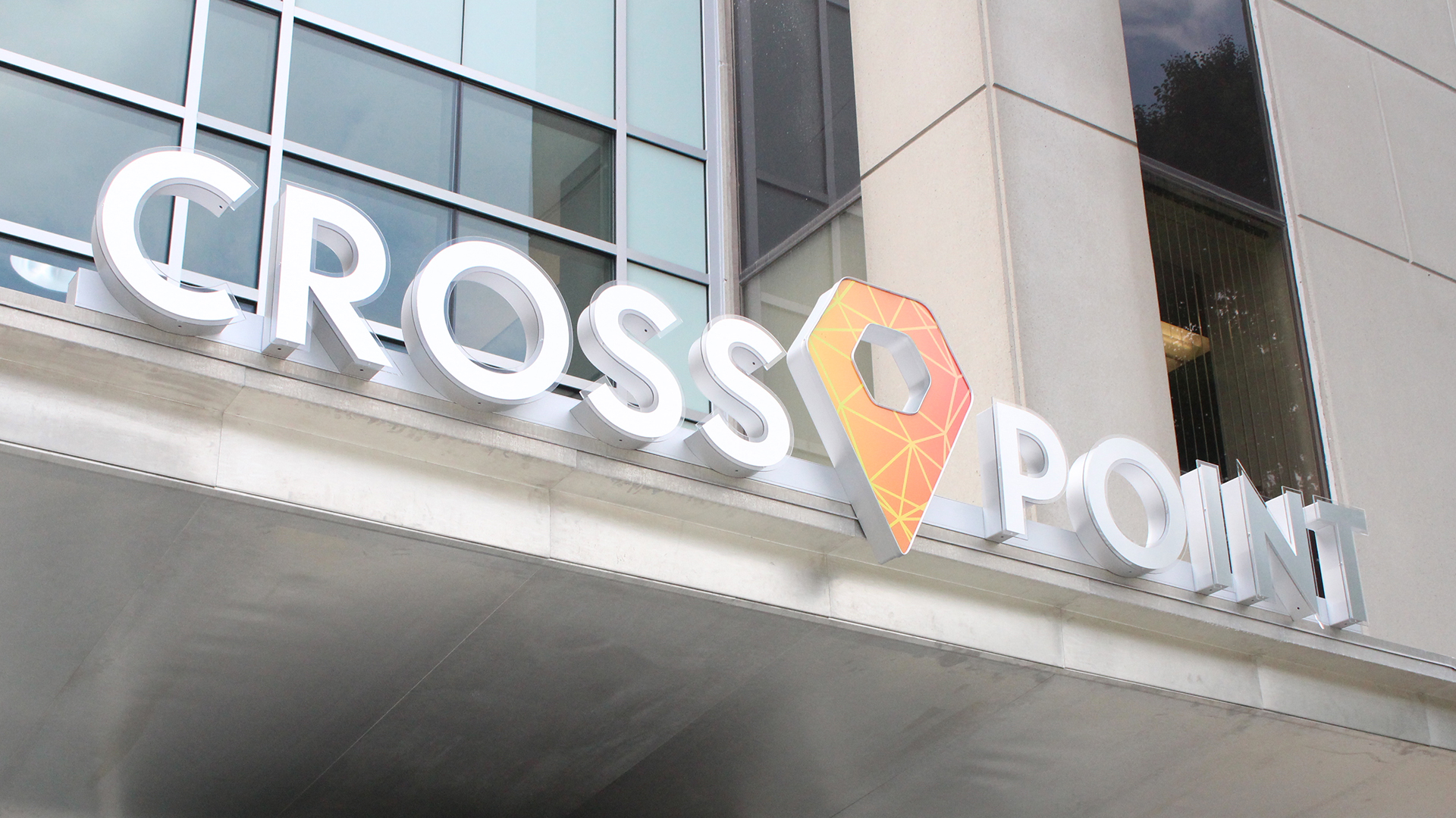
The new Cross Point brand, introduced first through the exterior signage, embodies the transformation of the property and exhibits a connected, interactive, and energetic feel. Vibrant yellow-orange colors are interrupted by intersecting lines that create a graphic shape similar to a map marker implying “You Are Here.”
