Ginkgo Bioworks | Boston, MA
Setting the Scene for Discovery
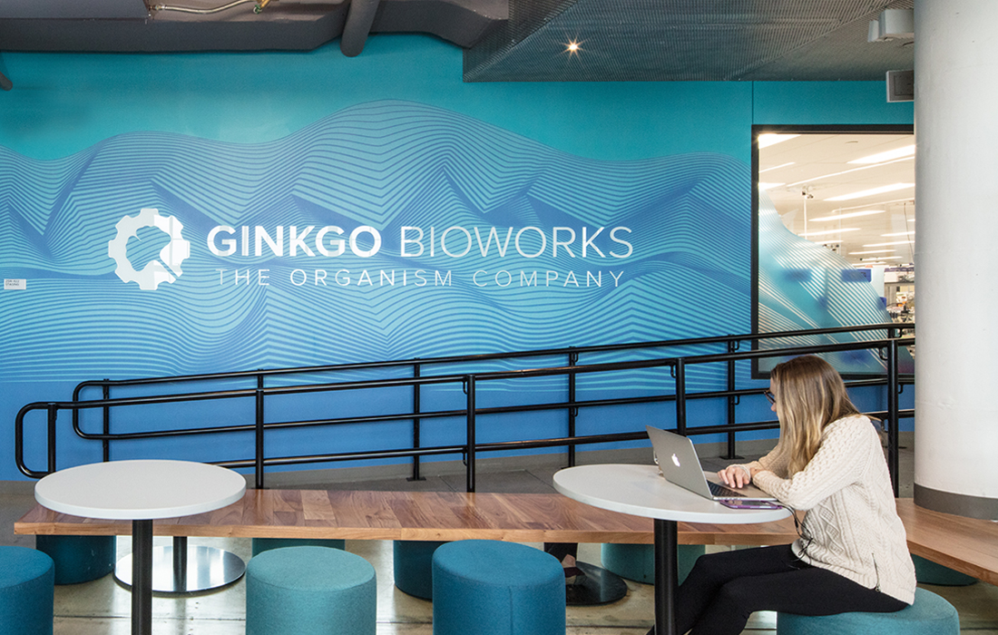
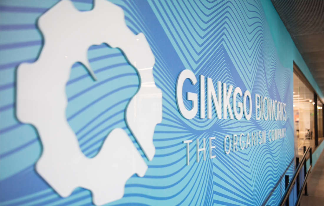
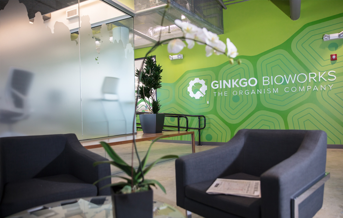
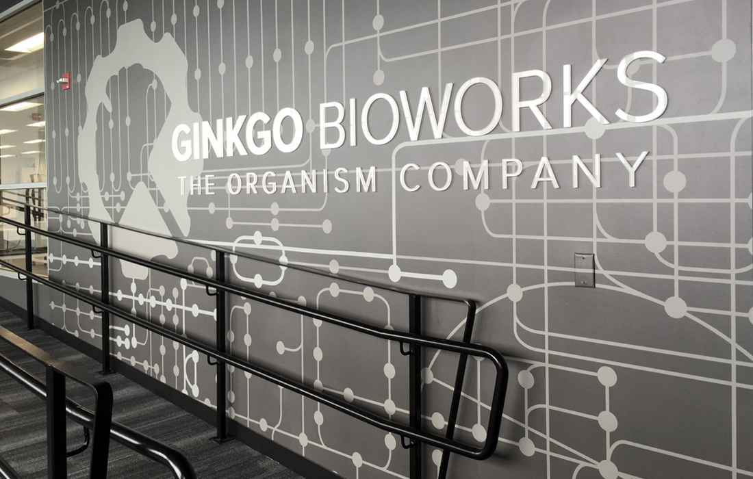
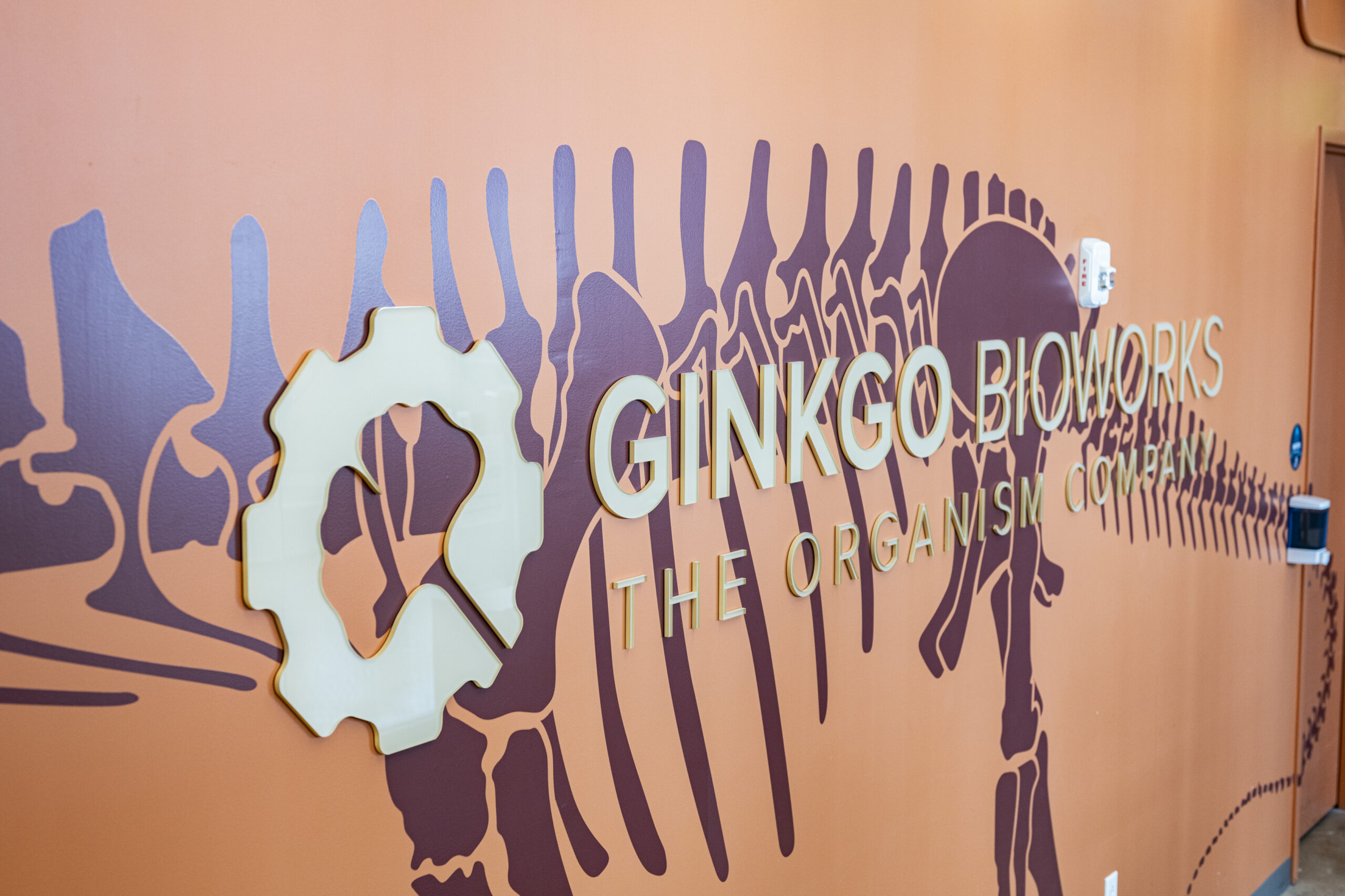
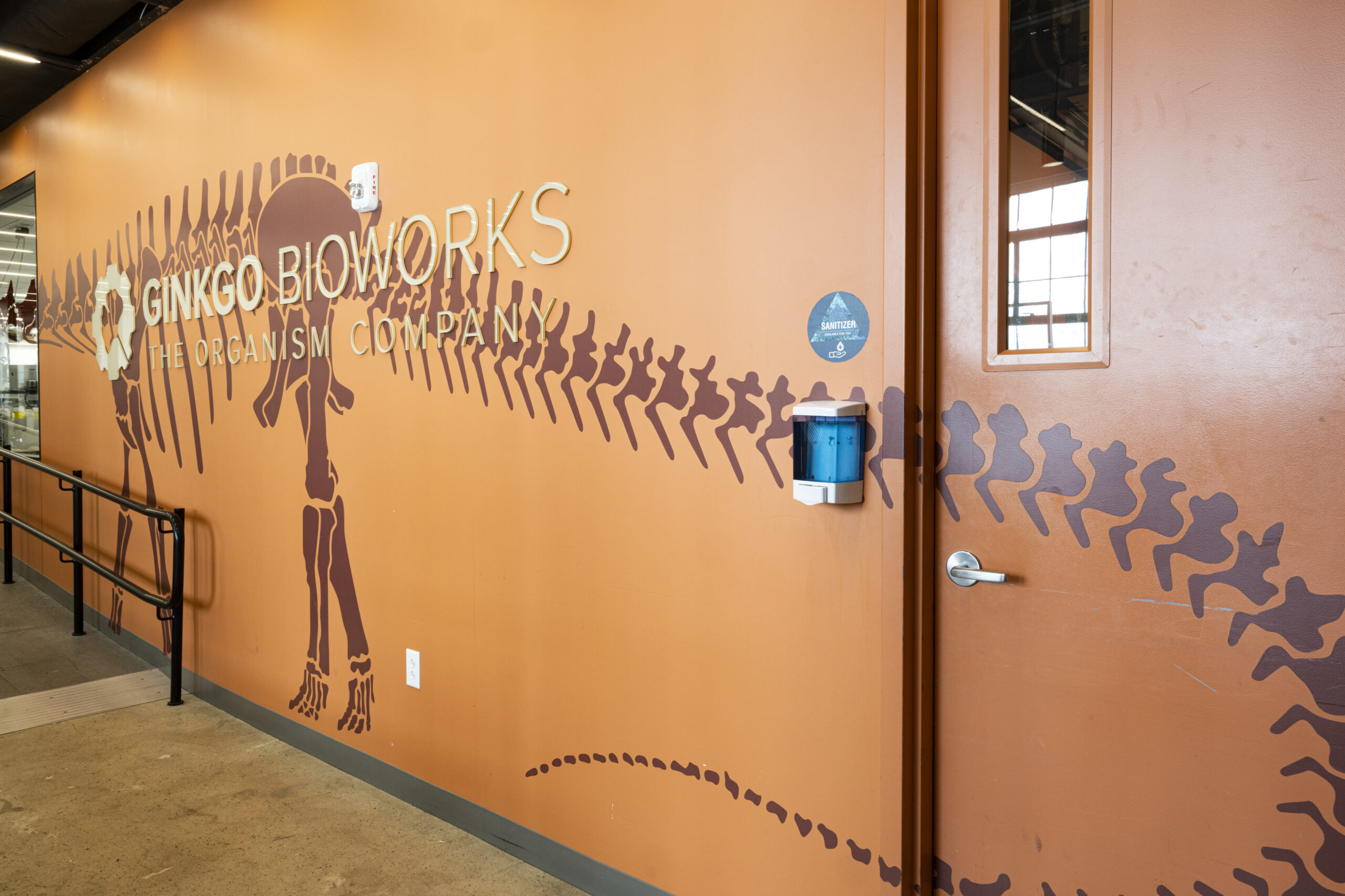
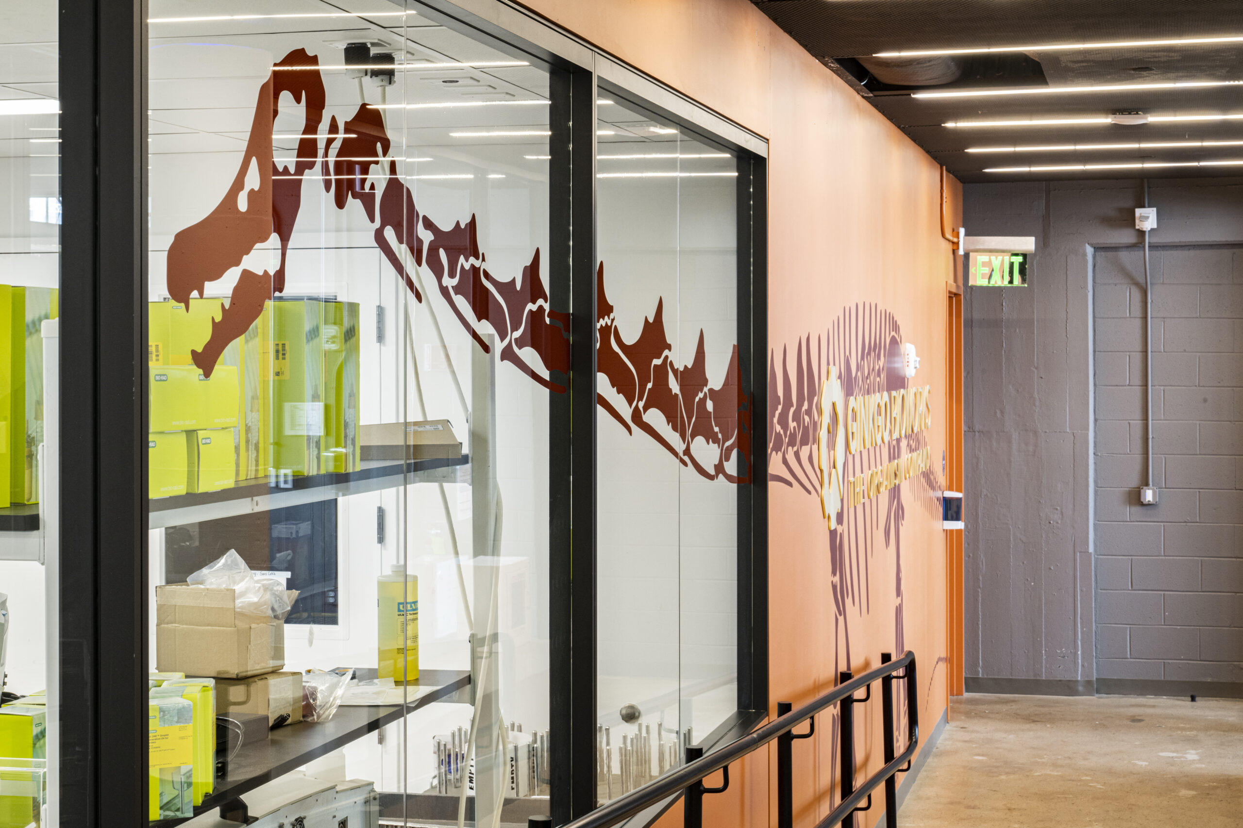
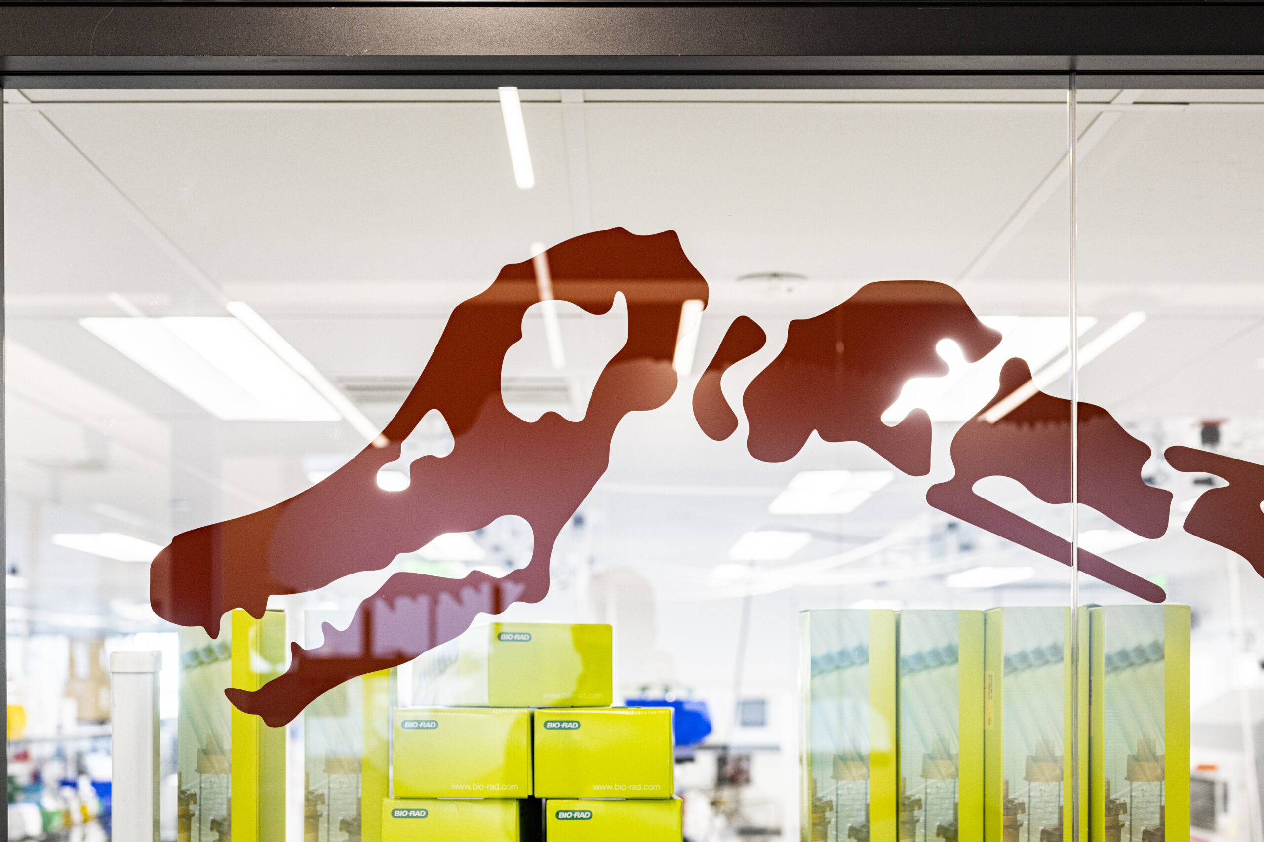
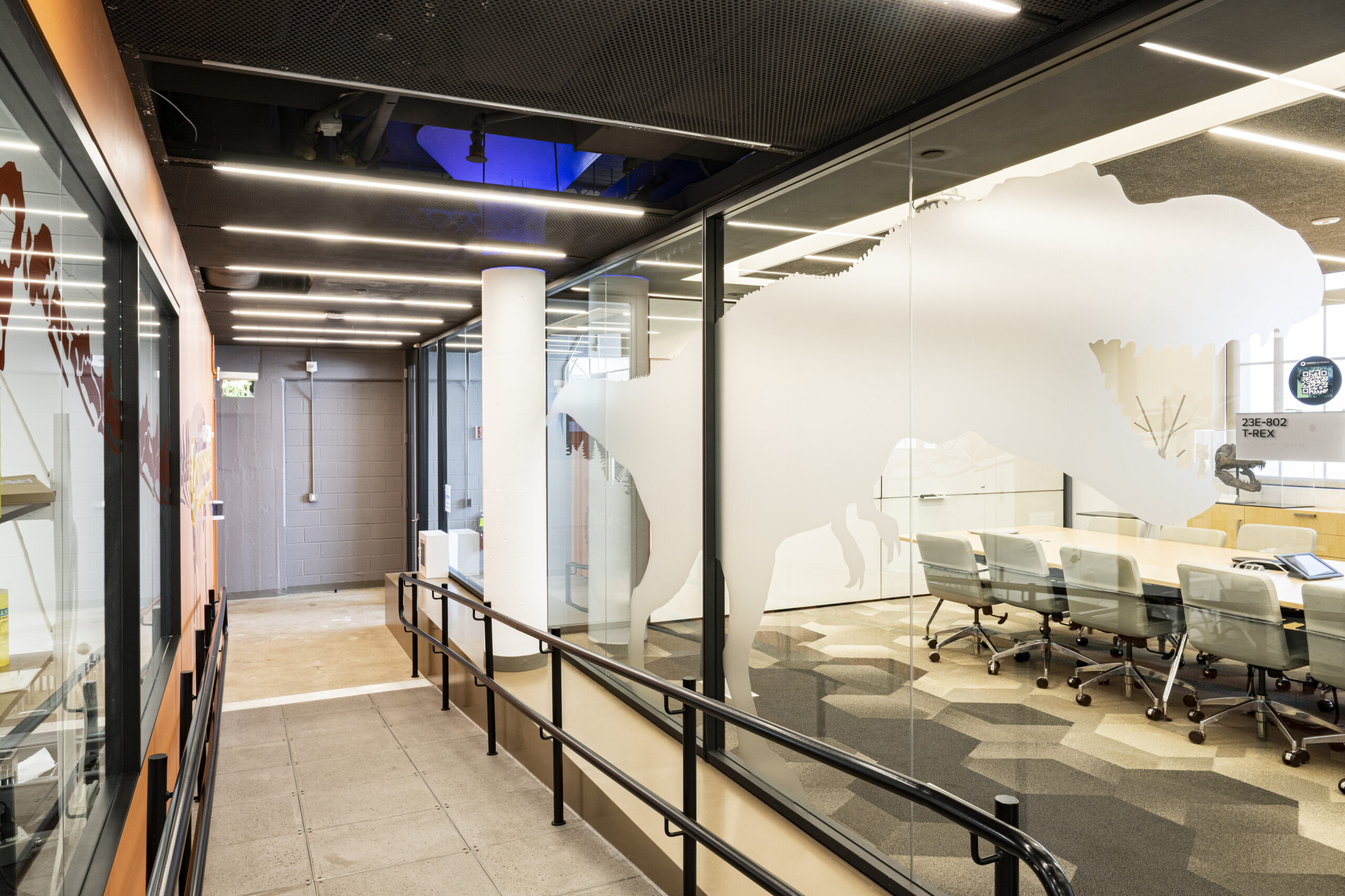
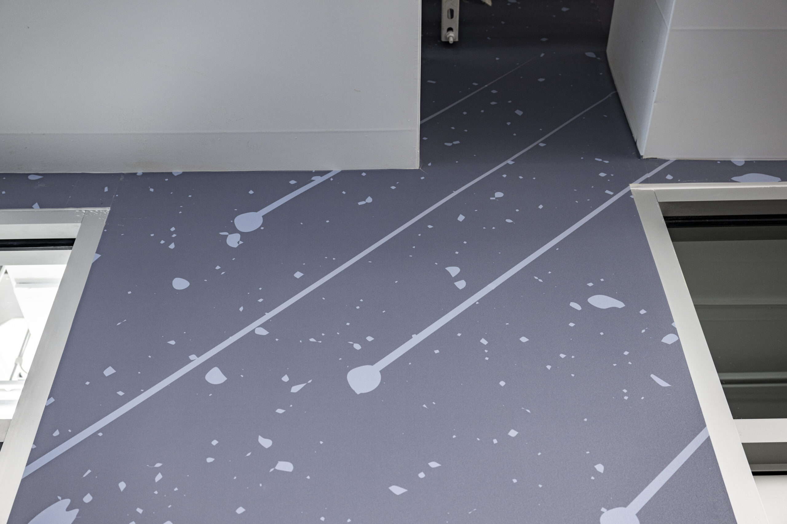
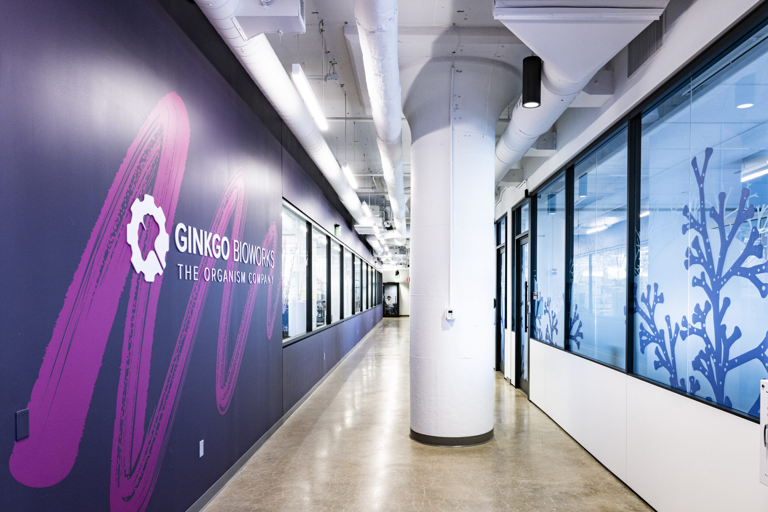
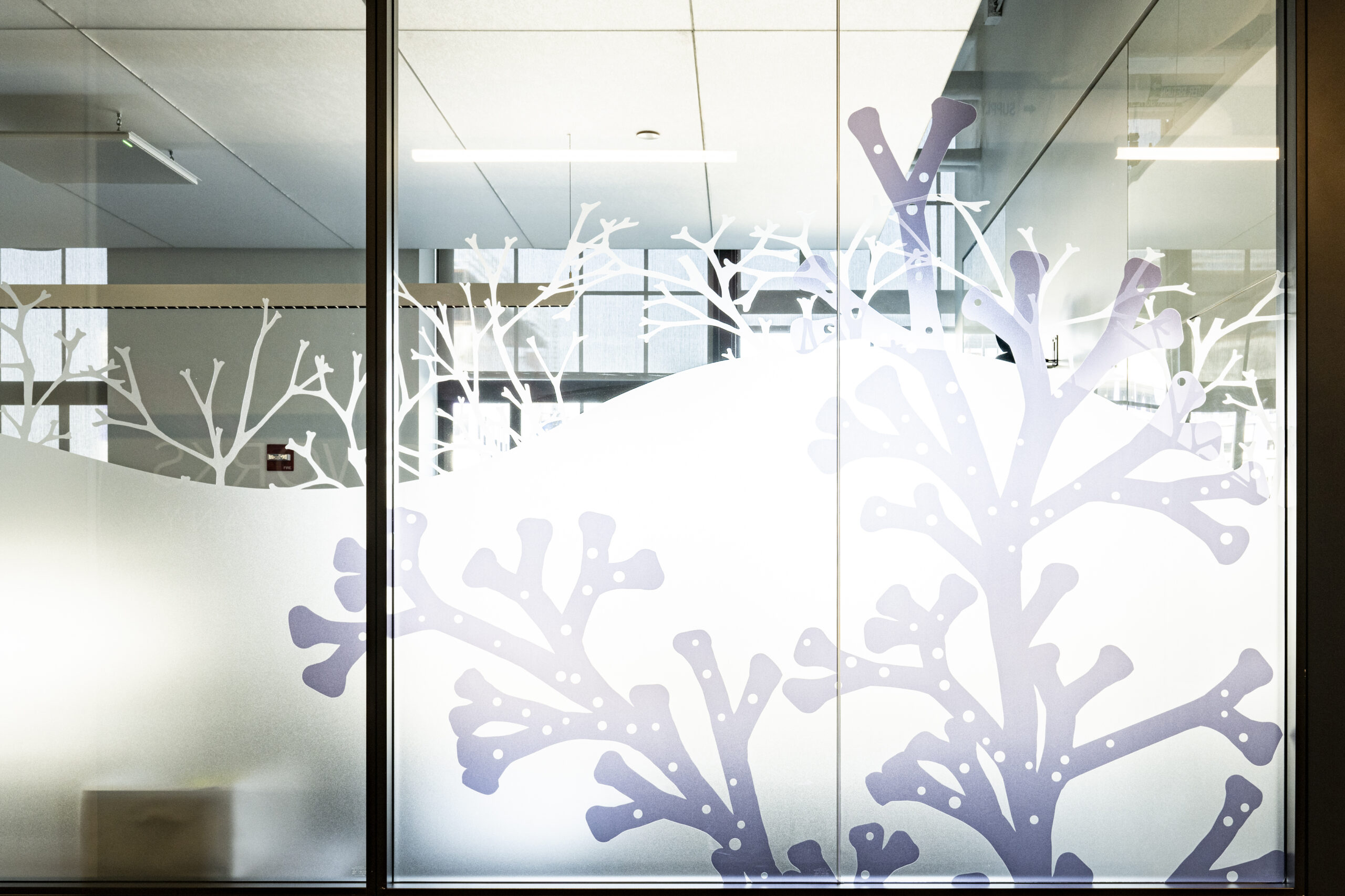
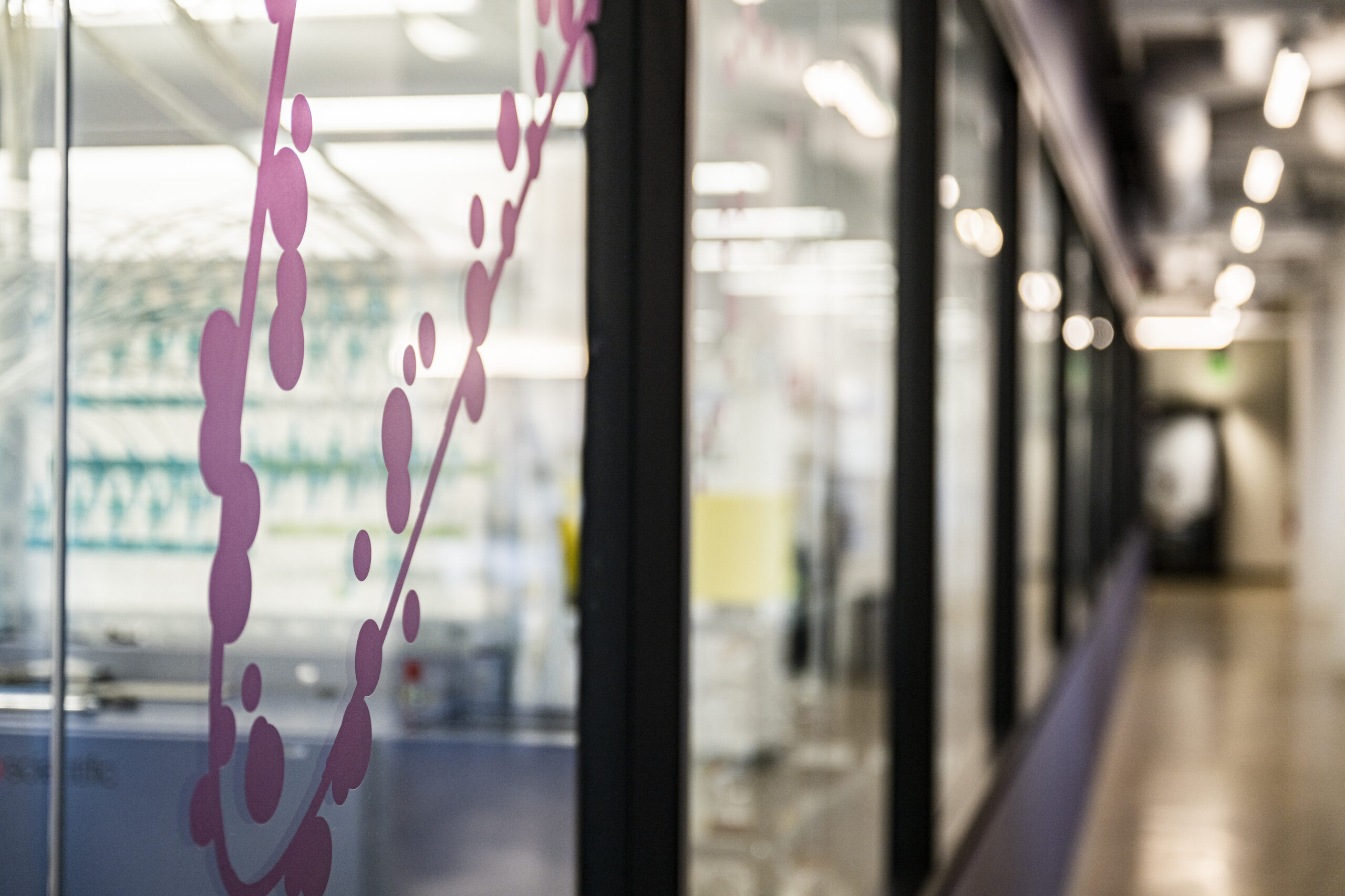
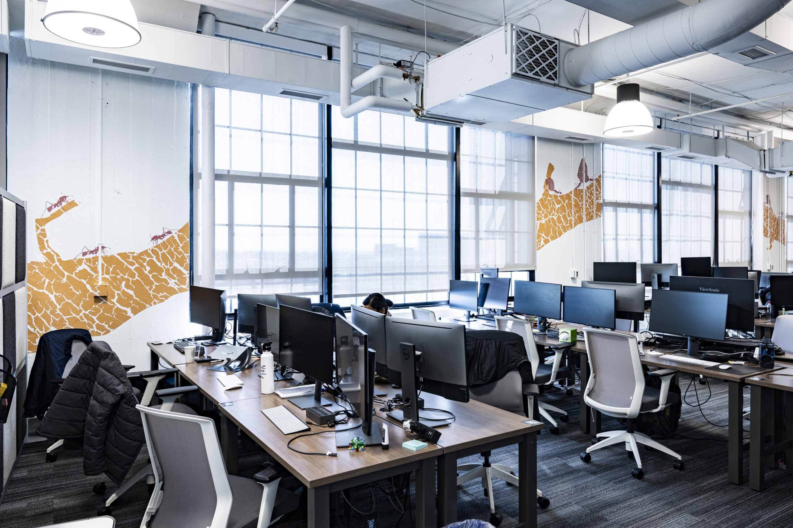
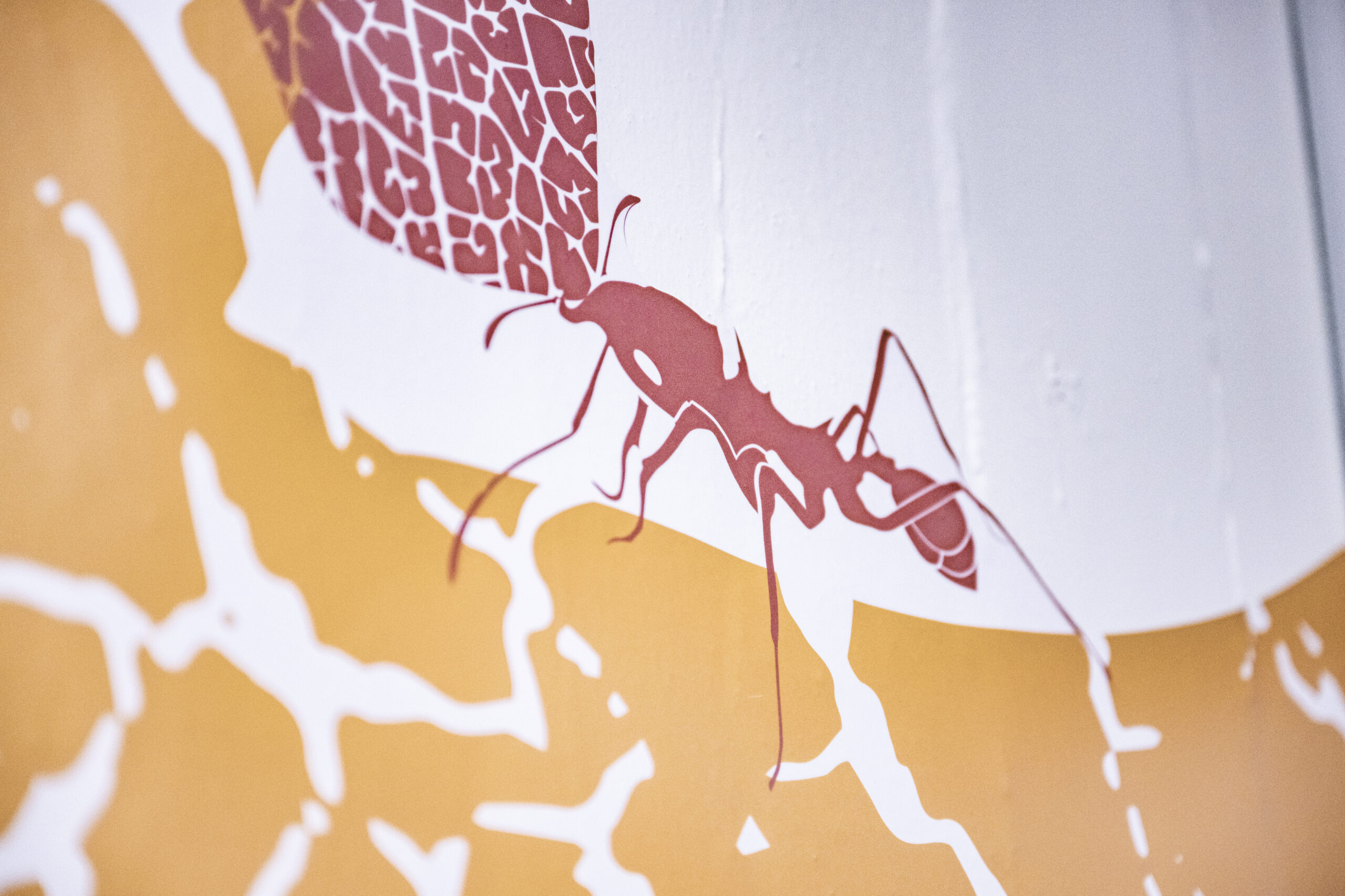
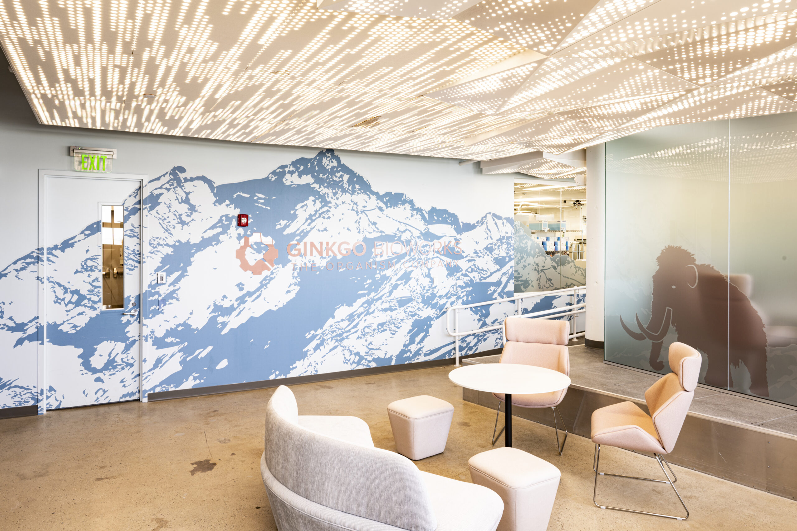
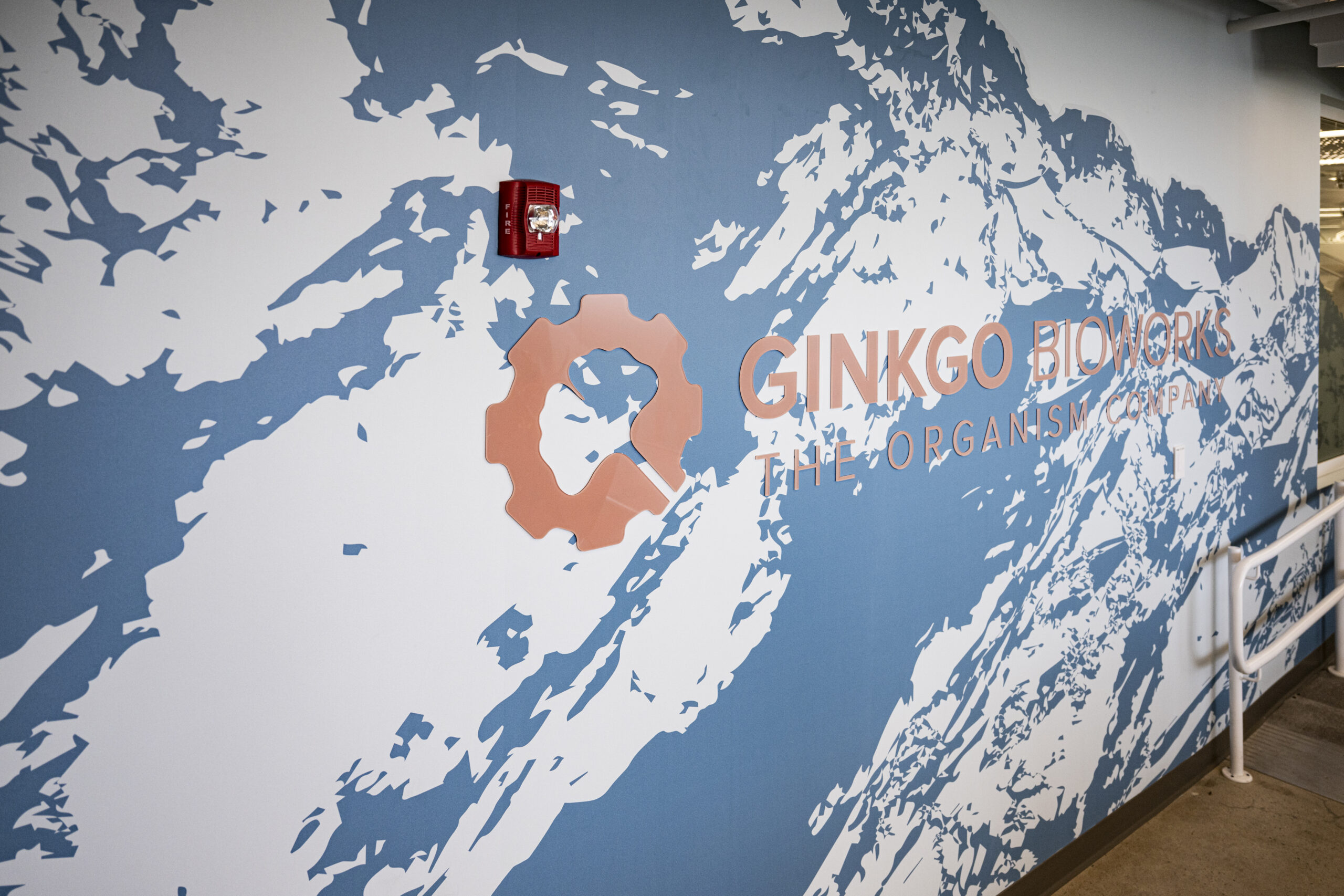
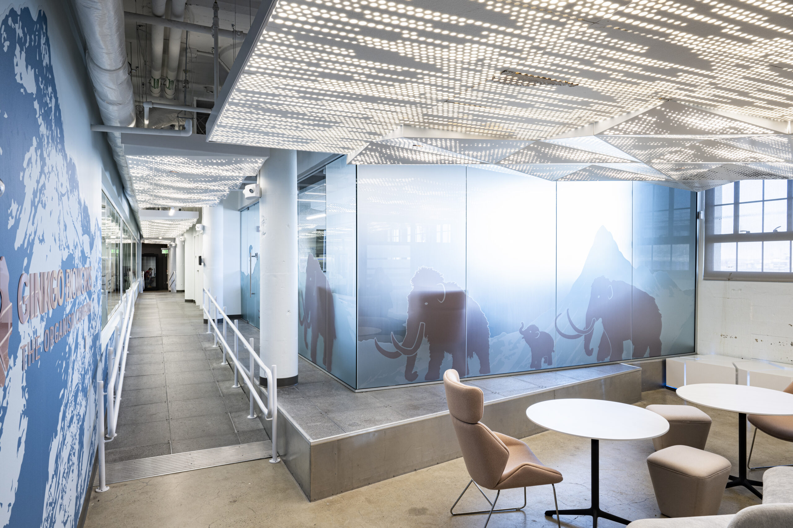
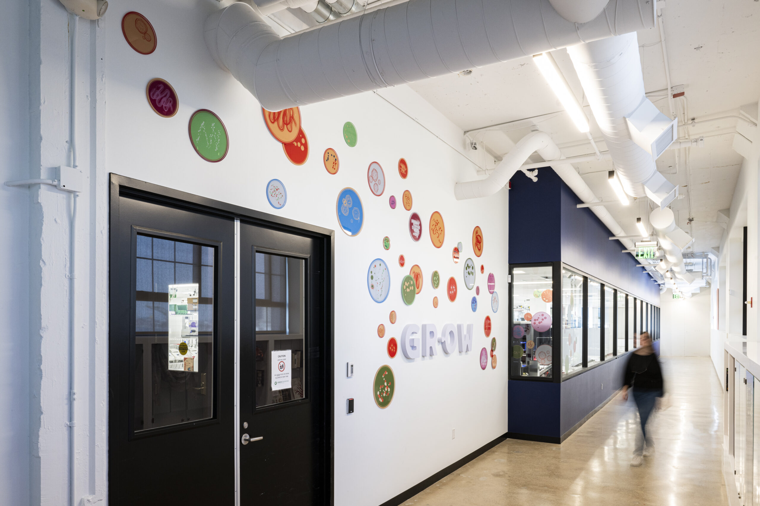
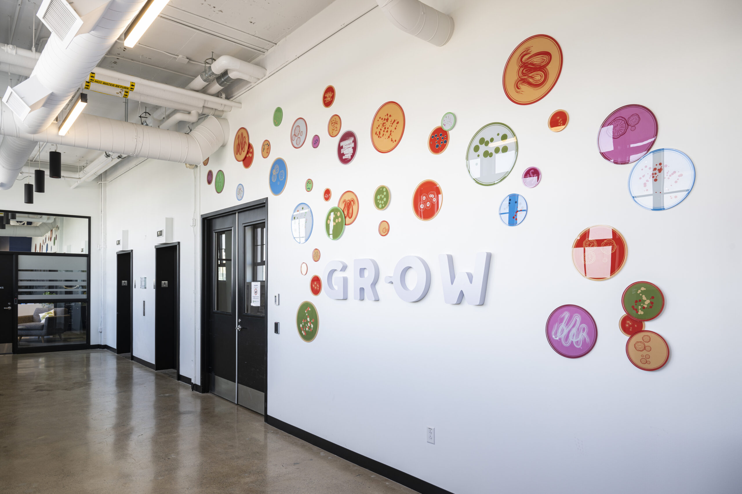
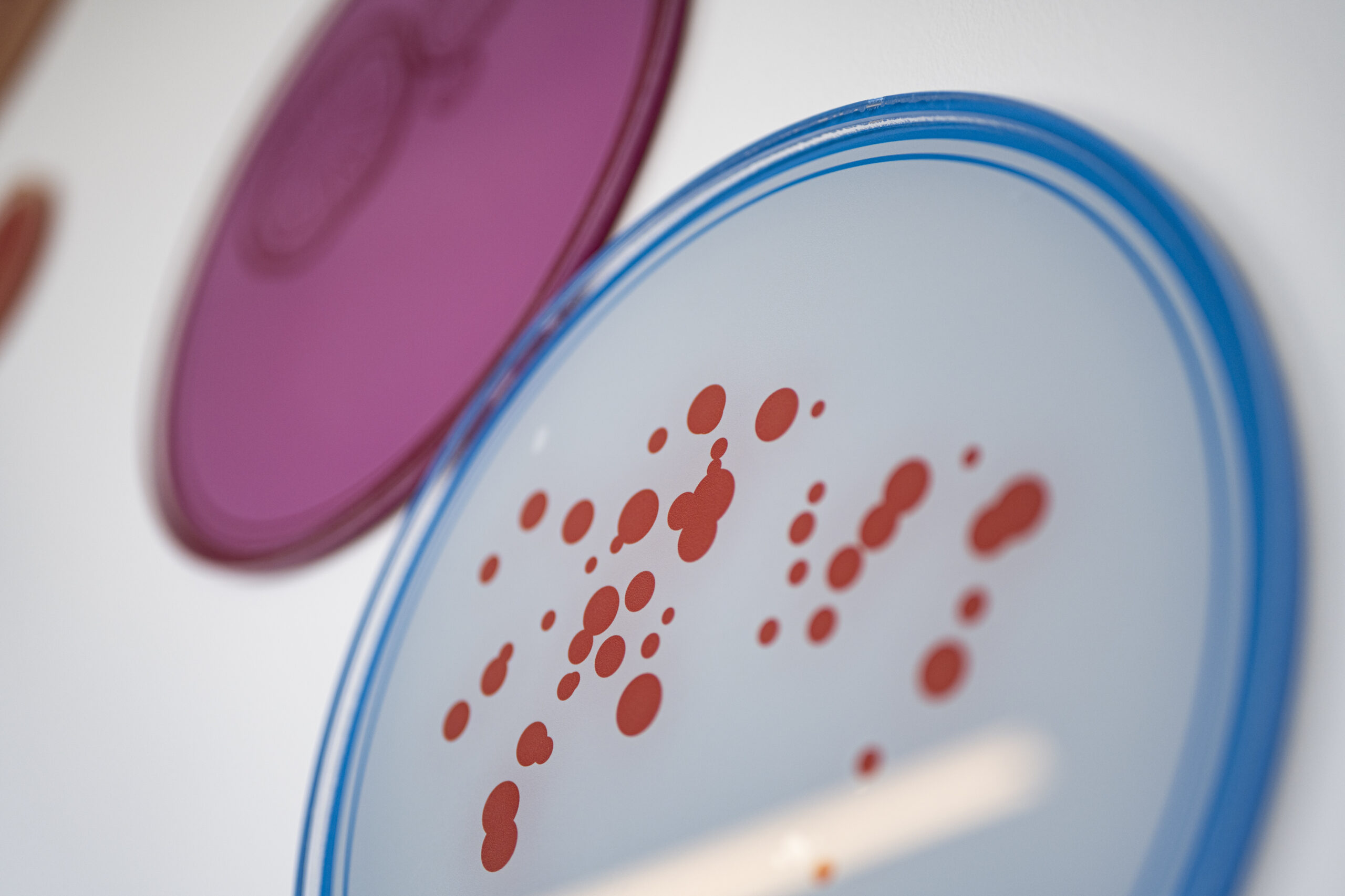
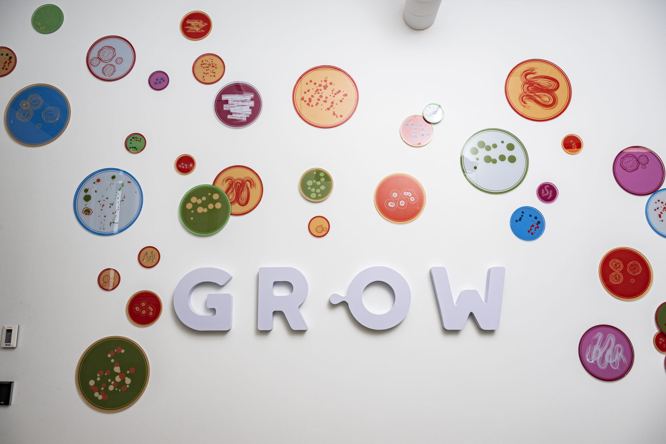
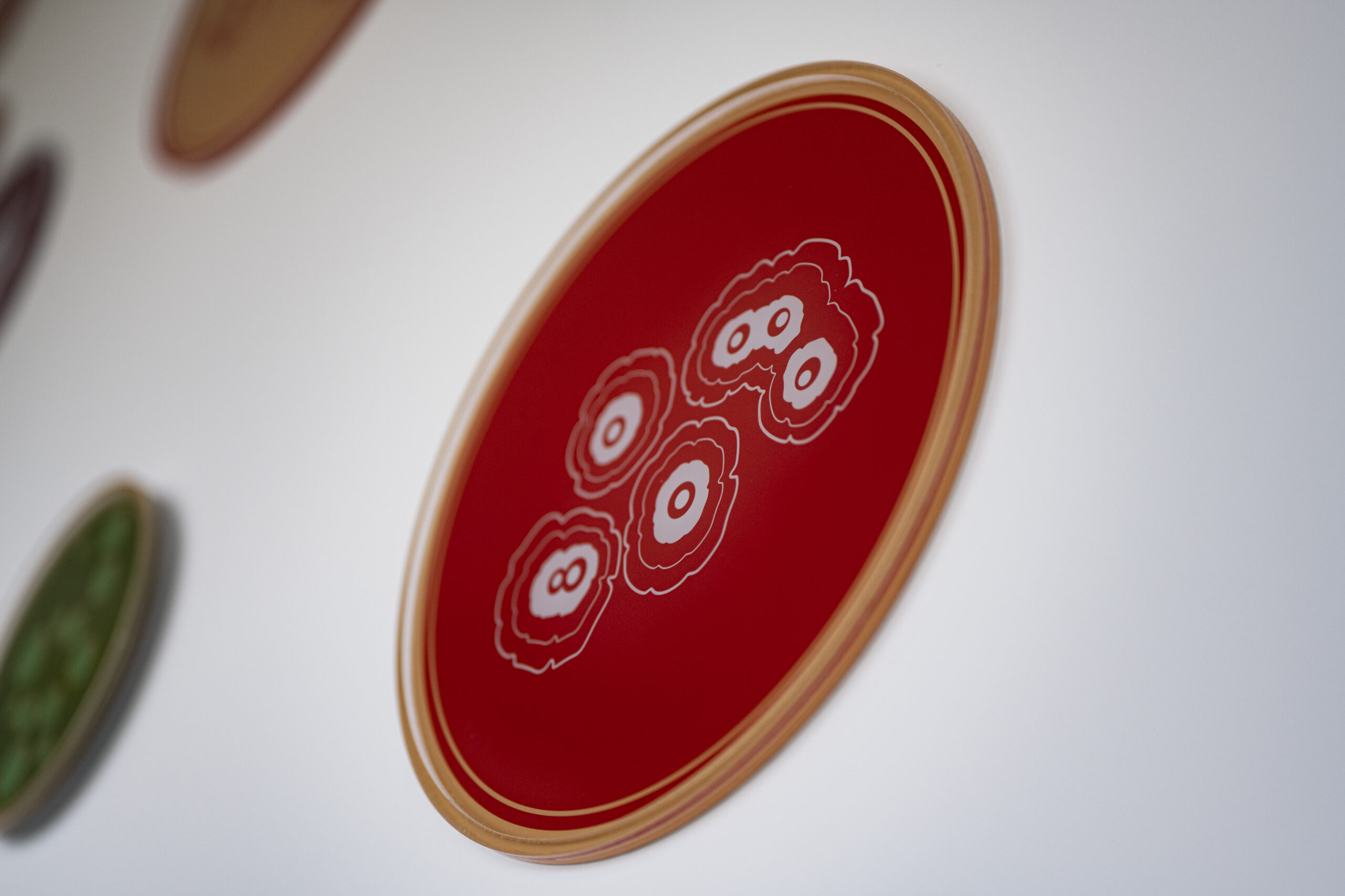
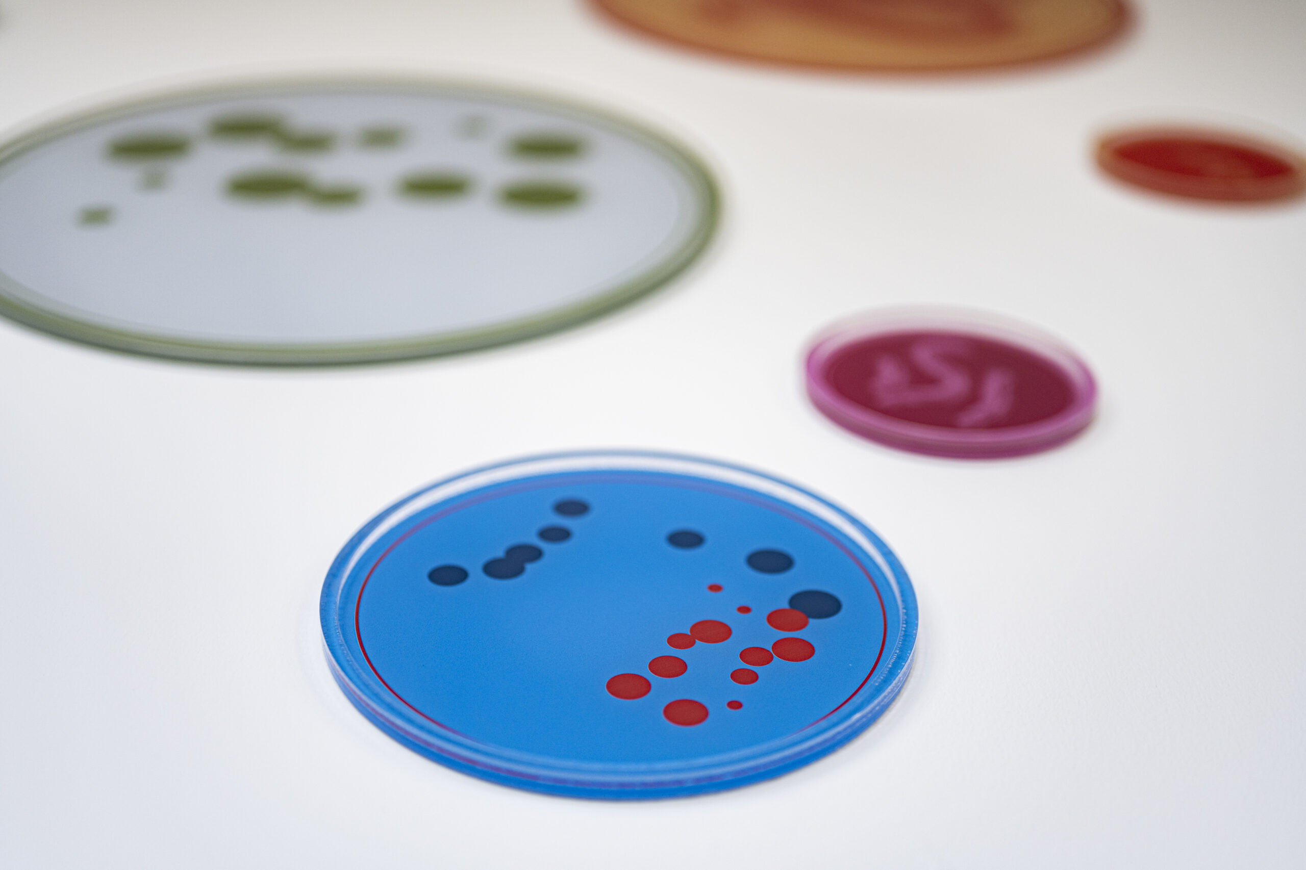
Ginkgo Bioworks recognized that they were on the verge of rapid growth, large financial investments, and heightened industry recognition. And they wanted to showcase their pioneering role in scientific discovery with a workspace that truly reflects their fascination with the beauty of science. That’s where we came in. To integrate the Ginkgo Bioworks’ brand throughout their new space, we designed an environmental graphics system of bold and bright visuals derived from themes of Metabolism, Tissues, Water, and Geologic Time/Fossils.
Insights
Interior Design, Environmental Graphics, Wayfinding, Signage
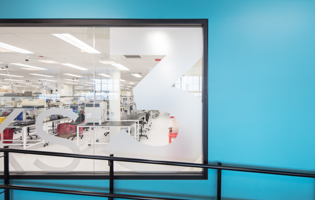
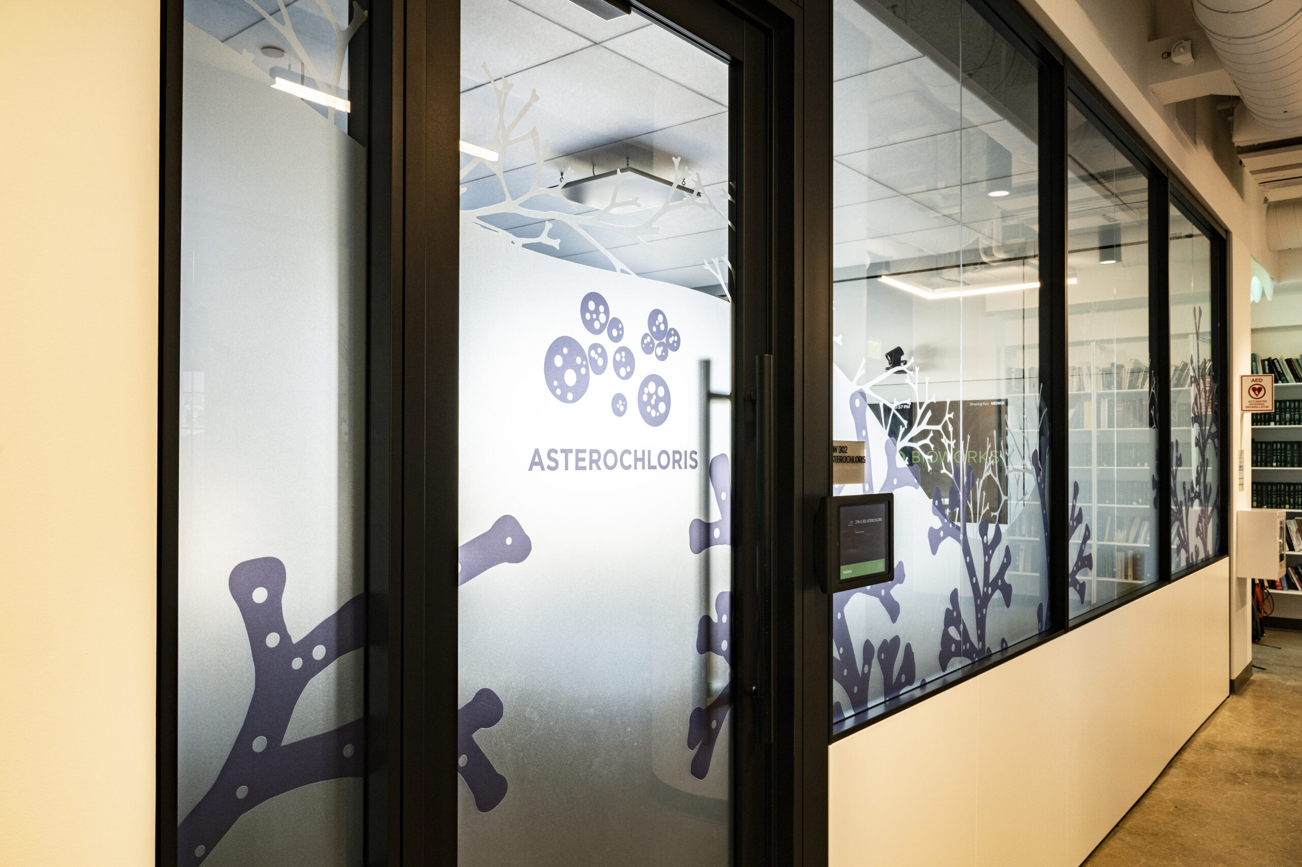
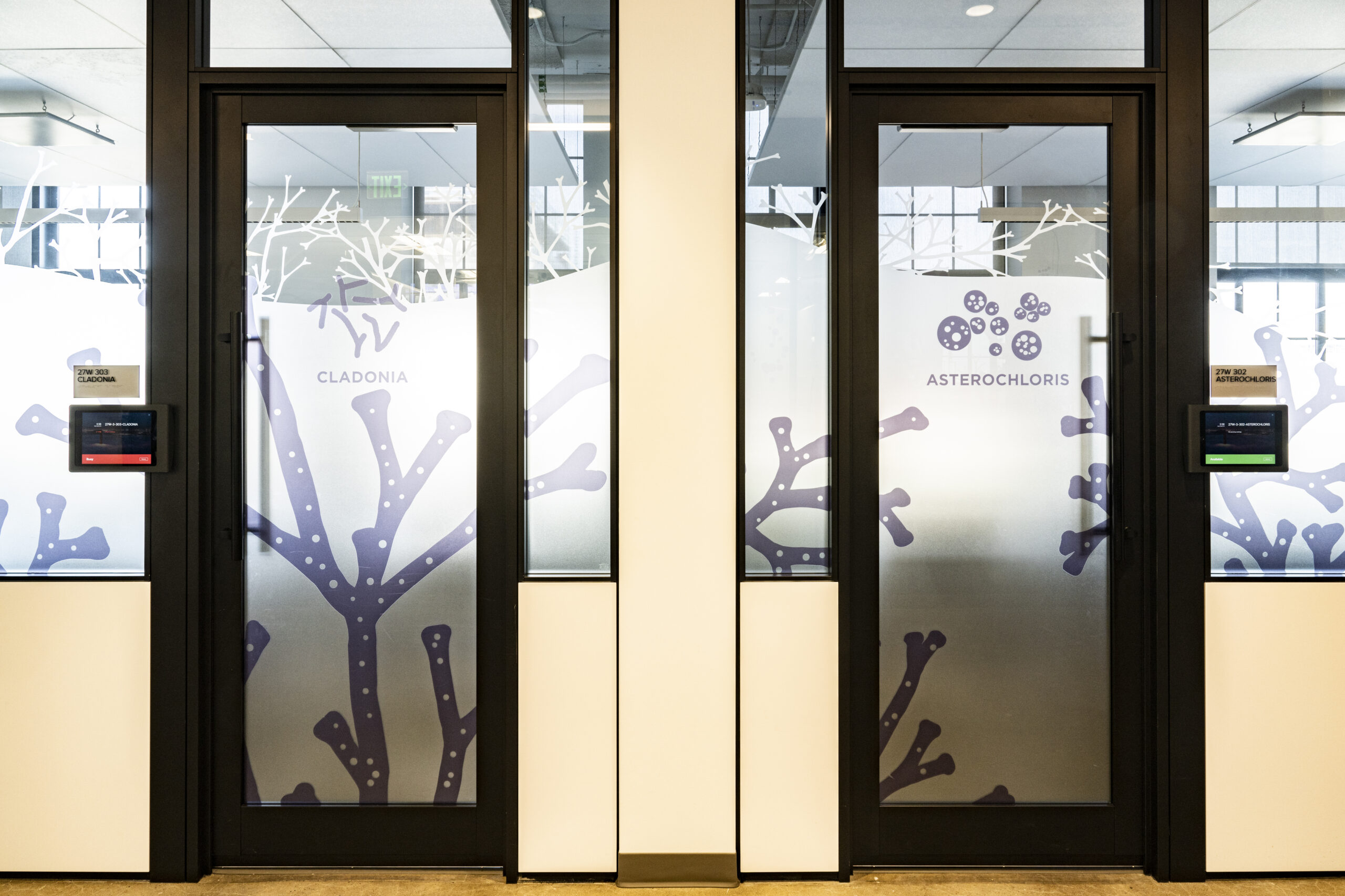
Ginkgo Bioworks is a fast-growing biotech company in Boston, designing custom microbes for customers across multiple markets. To create a workspace that would reflect their unique brand identity and passion for science, LLM Design created a masterplan program for wayfinding and environmental graphics that was designed from recognizable scientific elements. Our designers worked very closely with the creative scientific team to distill some very complex scientific concepts into a beautiful visual system that worked across many levels--from large entry graphics to room identifiers to more detailed wayfinding.
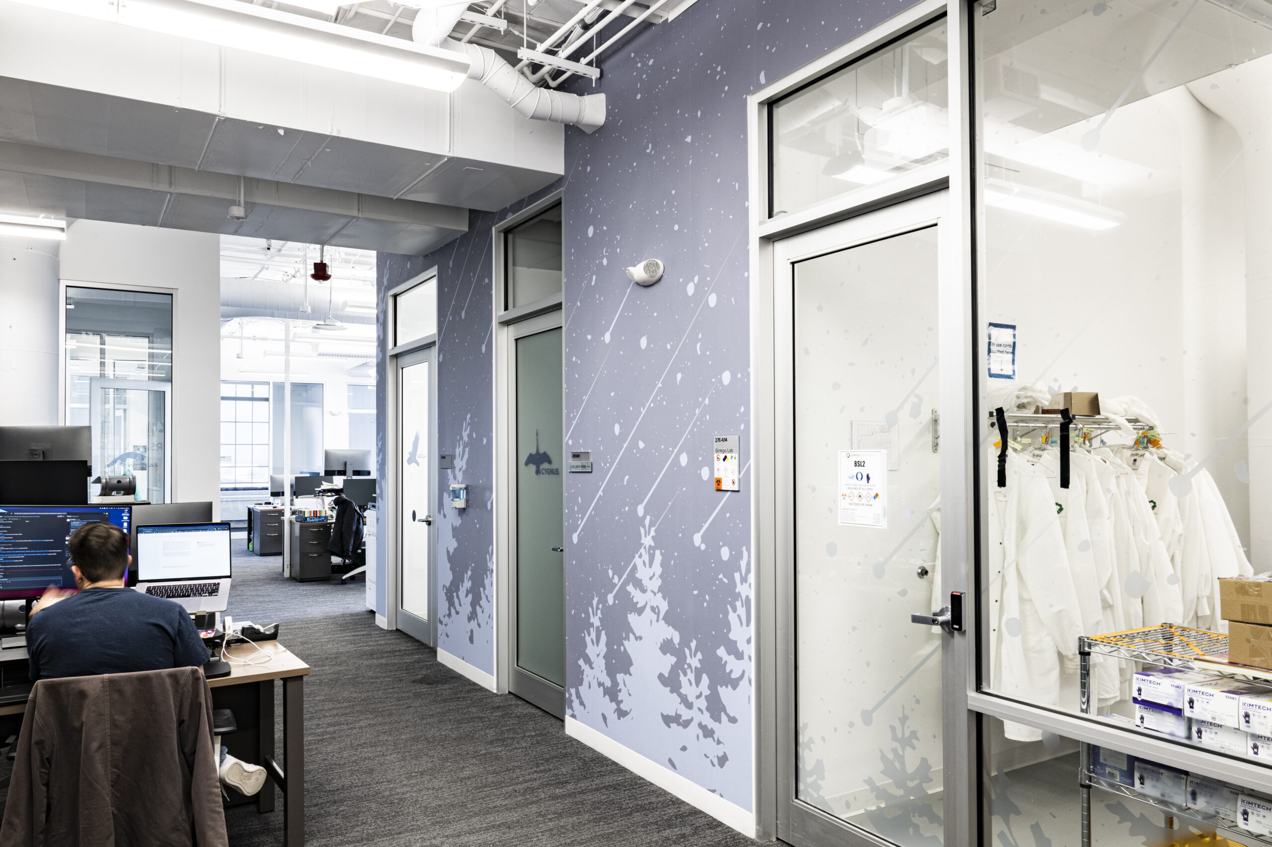
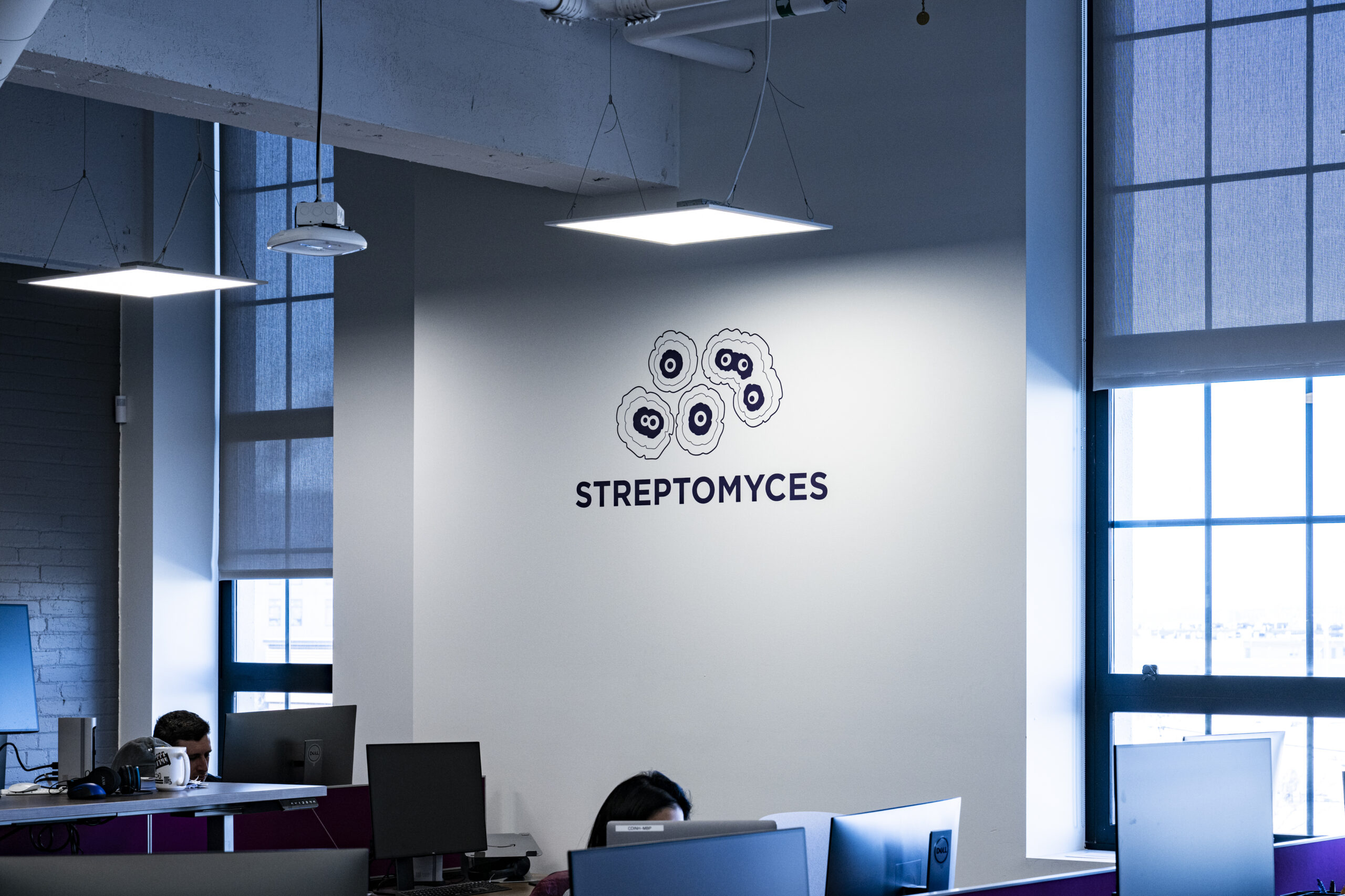
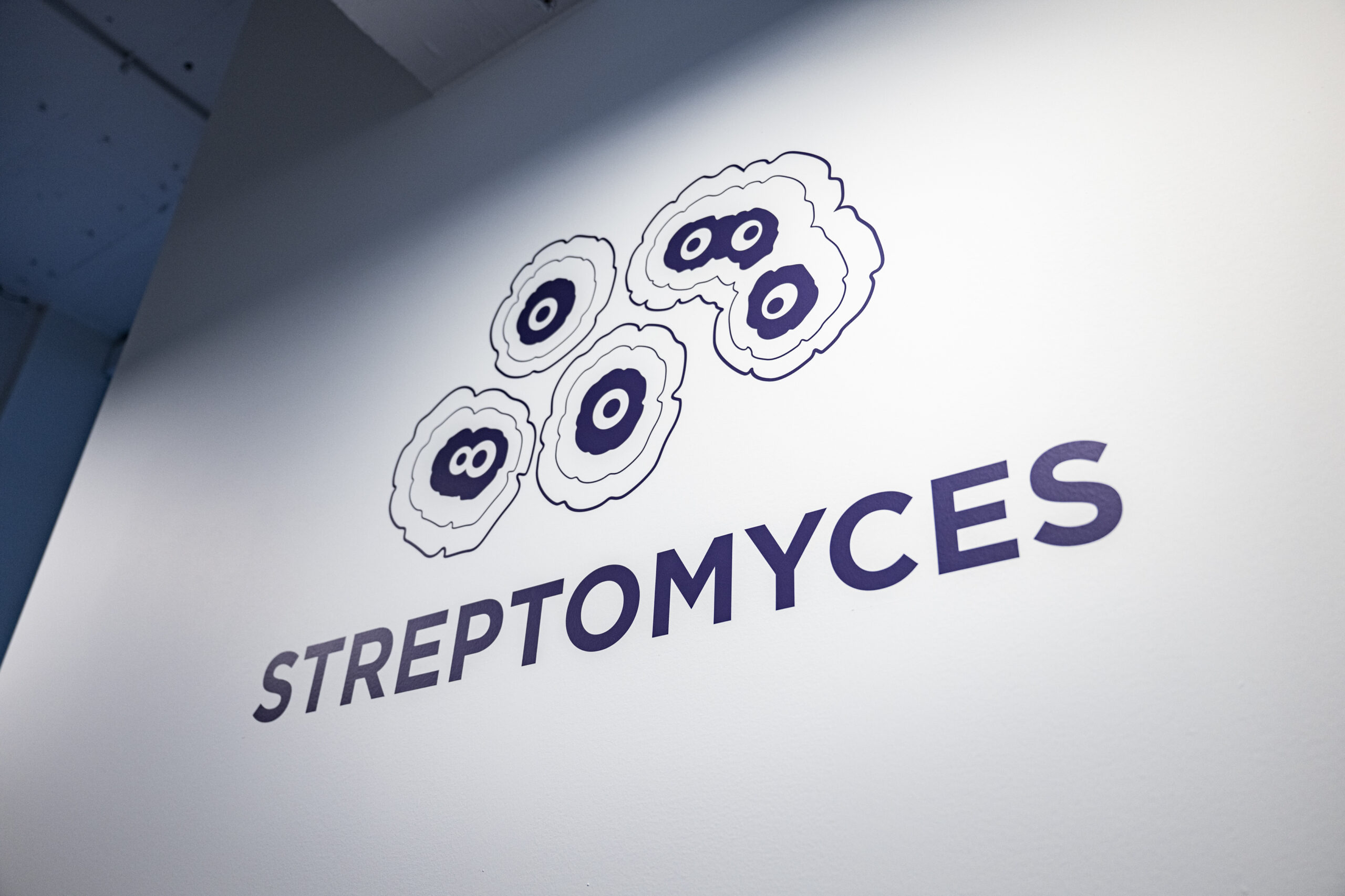
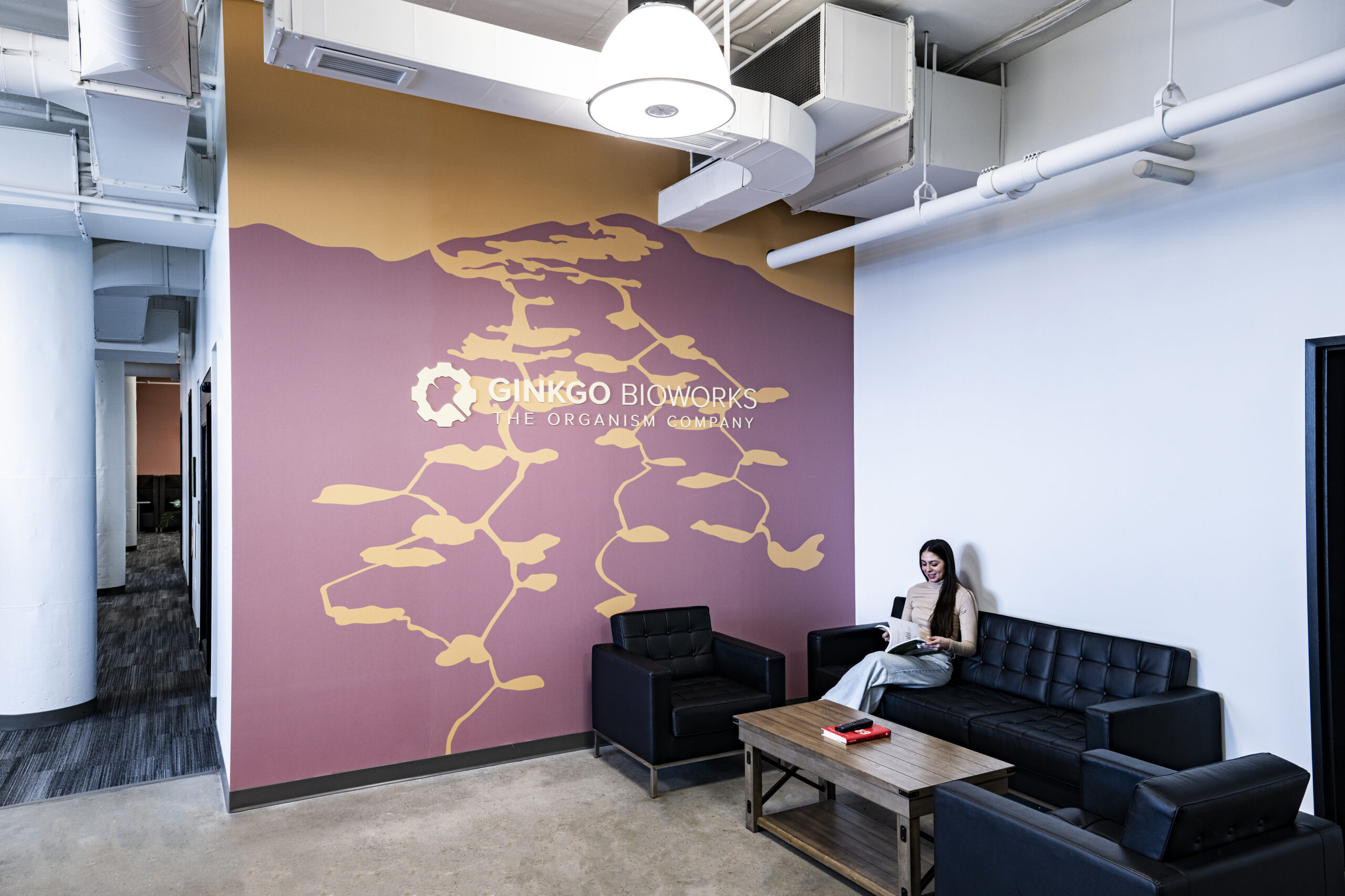
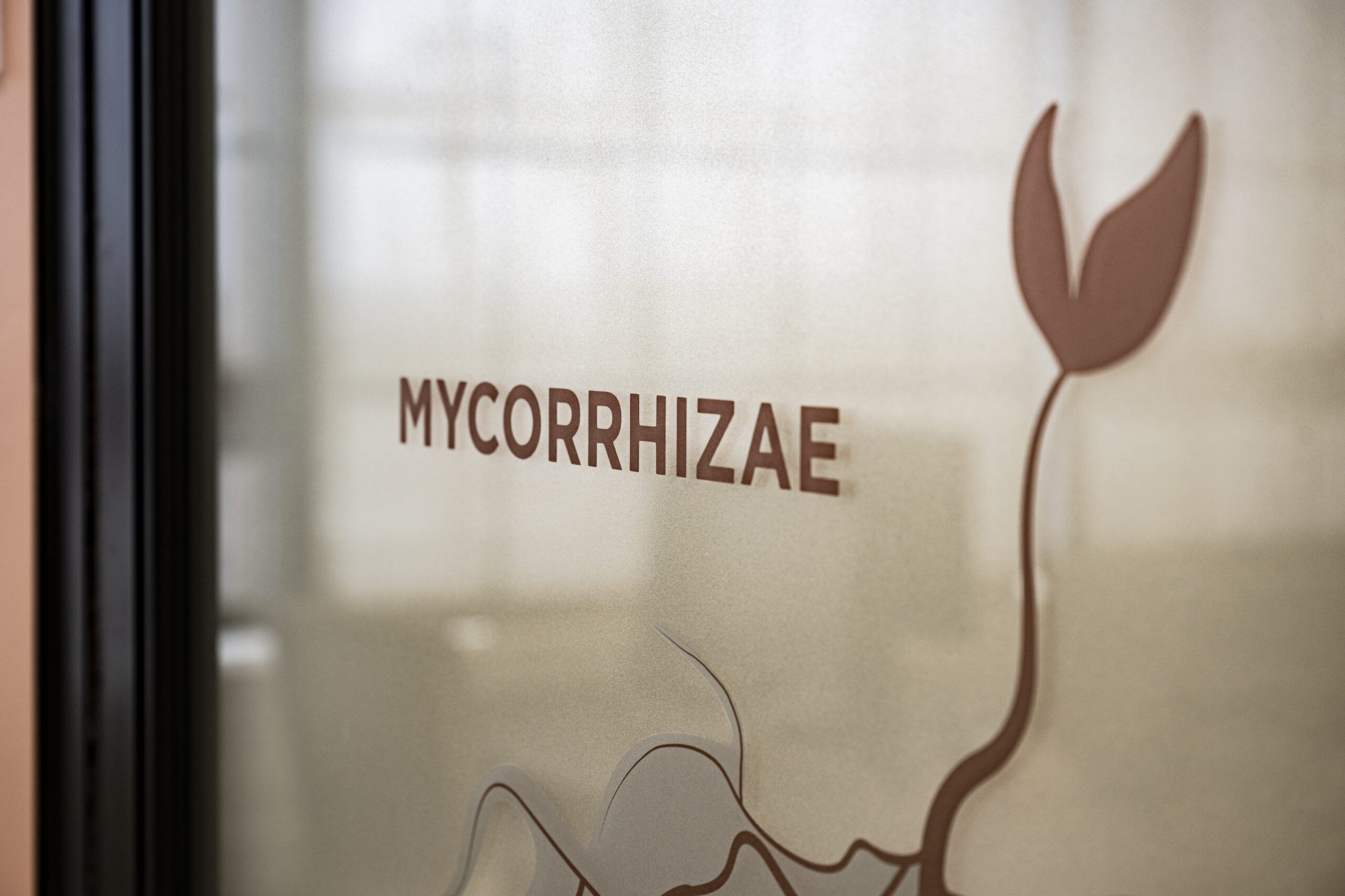
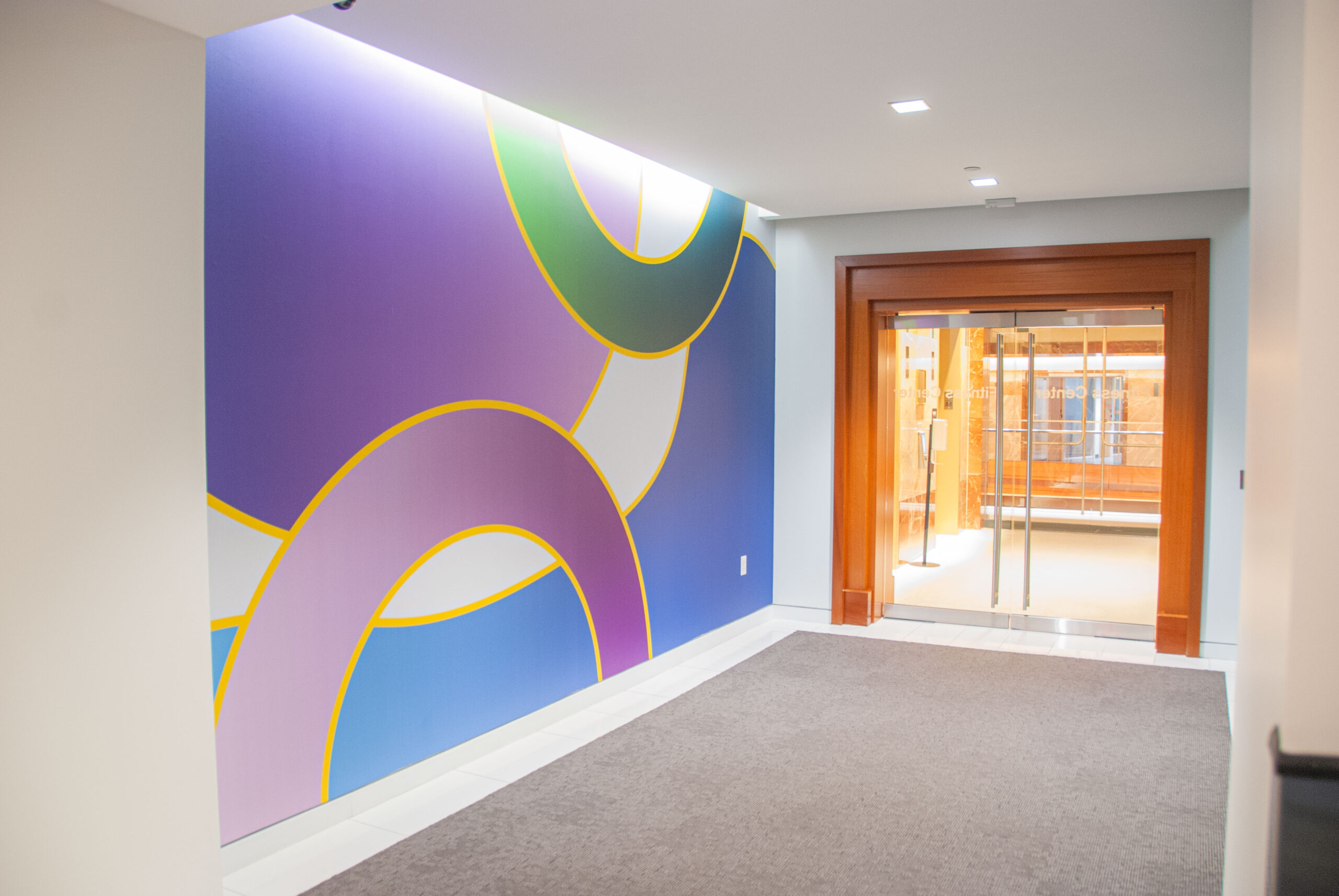
Each graphic theme, along with its color coding and room identifiers, was selected to correspond to the differentiating element of each workspace pod and represented an organic or metabolic function/system. The different pods each have a lab, workspace area, and conference rooms for which graphics were created, and the entry area of each boasts a vibrant “social media worthy” feature wall.
Ginkgo Bioworks, Studio Troika, Boston Building Wraps
Environmental Branding
Our design solution focused on the science happening at Ginkgo Bioworks–and how we could turn this science into that feeling of curiosity and excitement that their employees feel when they come to work everyday. We wanted to create a place that was inspiring, fresh, and bright. While the different pods are color coded and distinct in their own right, each one’s environmental graphics and wayfinding complements the overall Ginkgo Bioworks brand identity and, most importantly, their culture. This stylistic consistency helps to reinforce the company’s bold, pioneering identity throughout its workspace.
It’s been a pleasure working with the LLM team. The designers intuitively captured our whimsical and scientific style, translating it into an efficient system of environmental graphics. As a firm experiencing rapid growth, it has been important to create a space that reflects our brand values–not just for our employees, but also for investors, recruits, and customers.
Ginkgo Bioworks - Creative Director
Expansion Masterplan
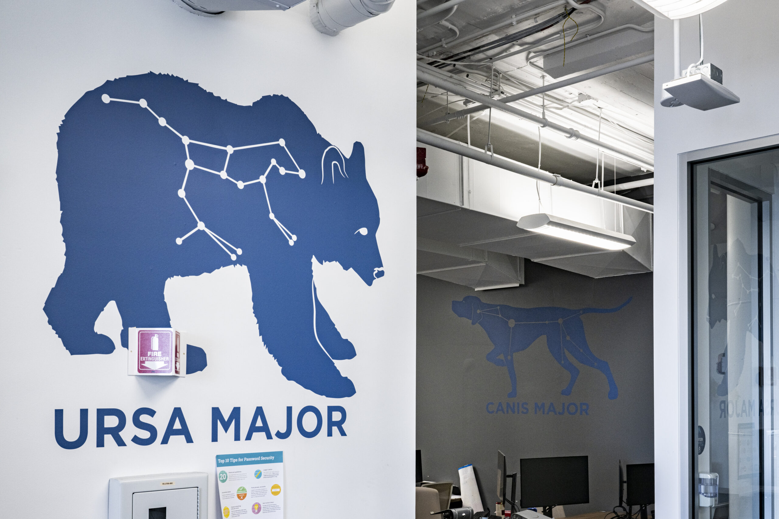
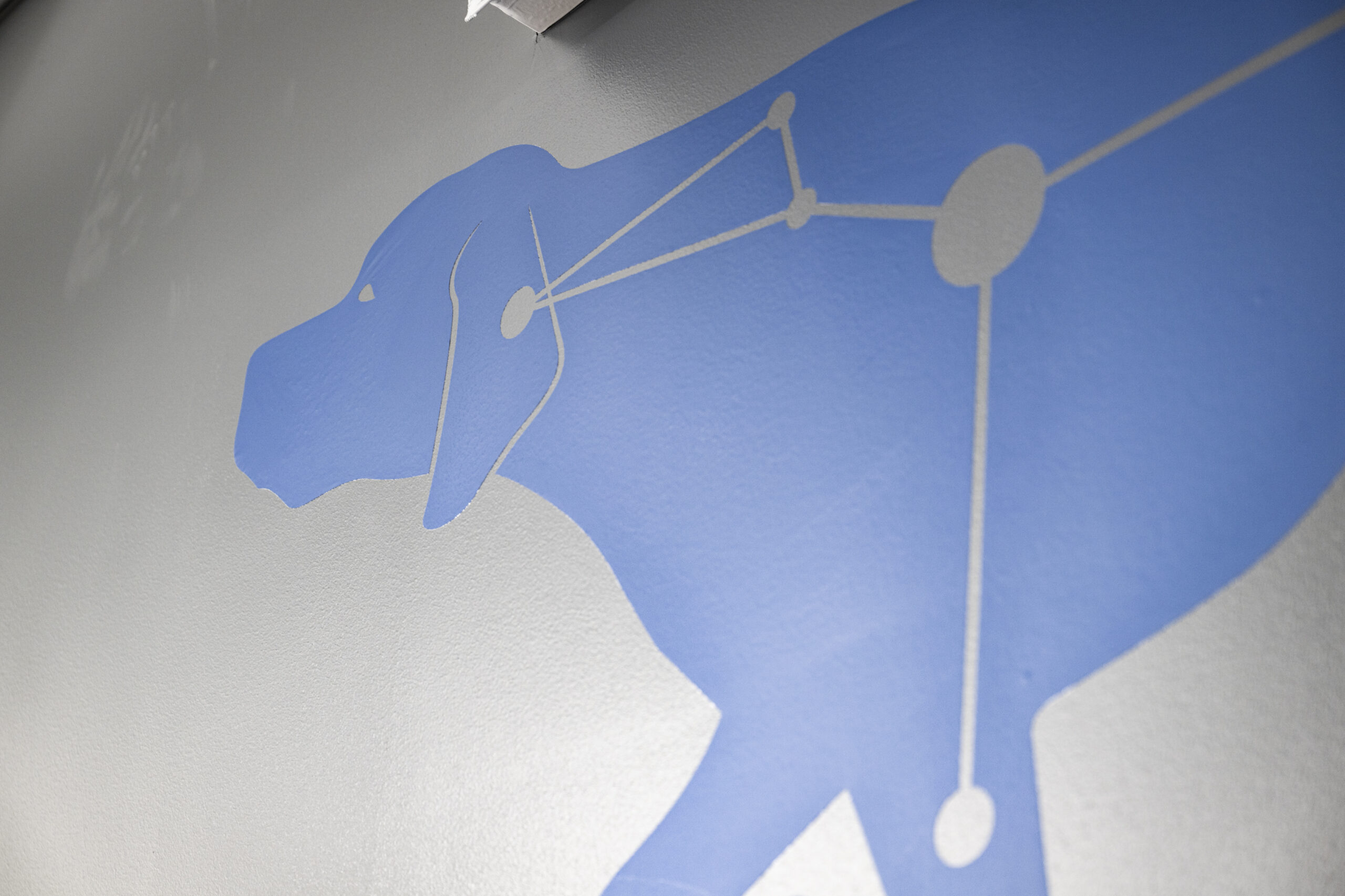
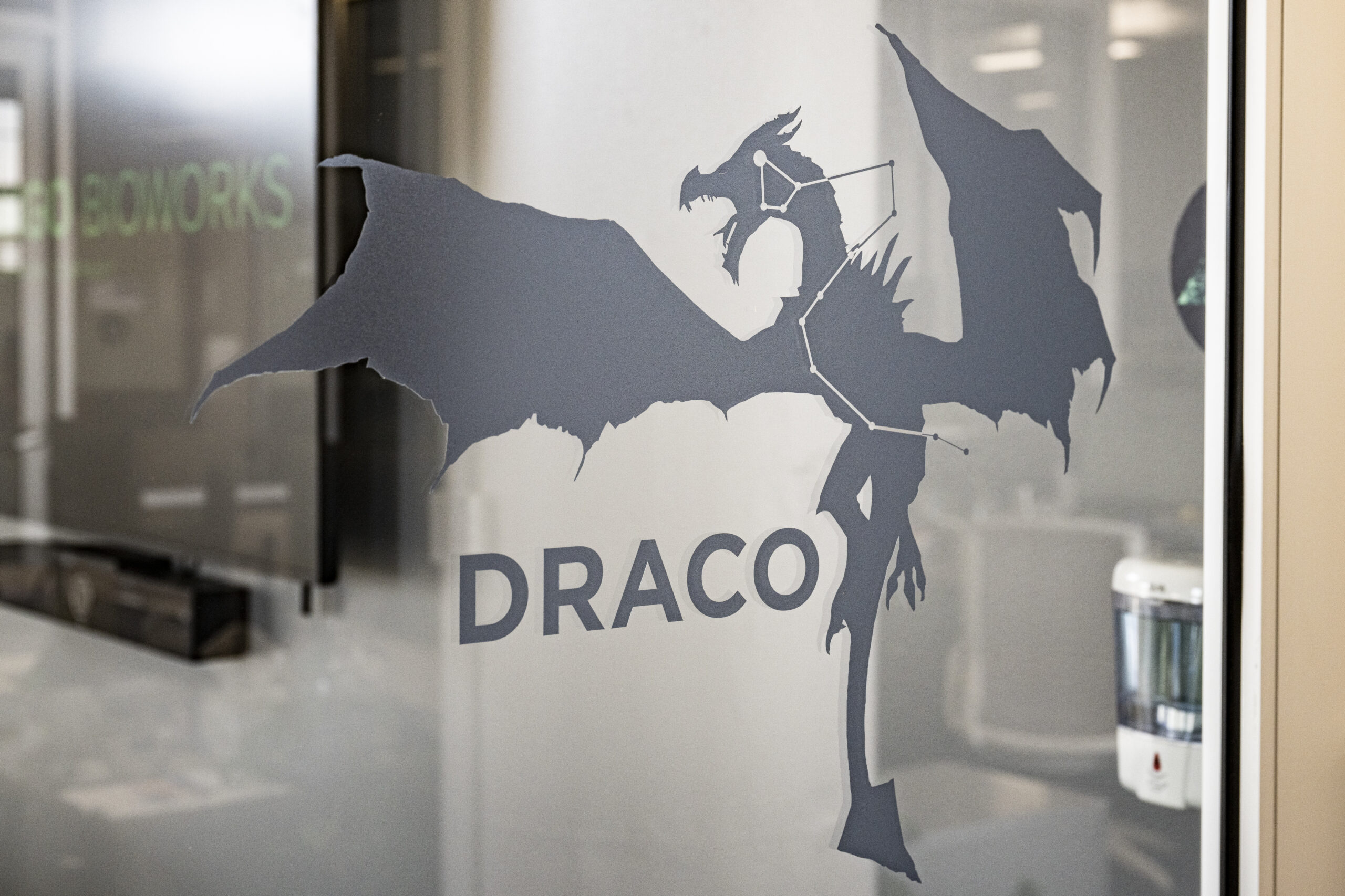
Our overall graphic plan for the new space was built on a “Powers of Ten” concept that begins with cellular structures and gravitates through levels ending in stellar systems. We researched a number of different scientific systems, working closely with their team to identify the elements that would be the best fit, and then tested various graphic styles before we found a scaled visual system that worked across the required various levels.
Masterplanning through
the Powers of Ten
We began working with Ginkgo Bioworks in 2015, at the start of their transition from a privately owned biotech start-up to a publicly owned global company. With the knowledge that their accelerated growth meant expanded real estate needs, LLM Design developed an environmental graphics masterplan that captures Ginkgo’s unique cultural essence, the work they do, and a wayfinding system with a recognizable identity.
Embracing Organisms, Environment, and Their Habitats
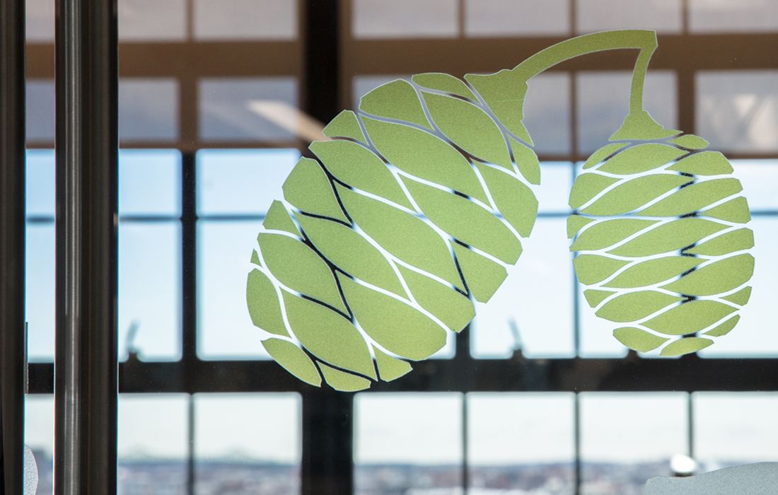
Inspired by Eames’ “Powers of Ten” journey, the masterplan established a system of colors, themes, and graphics that started at the molecular level and expanded to celestial. With origins based in biology, all themes connected to living organisms past, present, and future. From habitats, animals, cell structures, and plants, a variety of sketches were translated into a visual language that becomes a Ginkgo stamped space. These visual elements seamlessly conveyed Ginkgo’s commitment <br> to biological innovation and sustainability.
Crafting the Masterplan of Graphic Choices and Color Palettes
Design is not just about aesthetics; it’s a language. At LLM Design, we meticulously crafted a visual language for Ginkgo that echoed their personable character. Room names and graphics such as Cladonia and Rhizobium (we became bio nerds during this process!) resonates with their mission to “Keep biology weird”. We embarked on the task of finding that perfect balance, where scientific precision meets creative design. The result was a harmonious blend of vibrant, nature-inspired color palettes, symbolizing growth and innovation, along with typography and imagery selections that underscored precision and accuracy.
Continuing to GROW
We continue to work with one of our favorite clients as they expand into different markets and locations. Across the Charles River into Cambridge, MA and across the US in West Sacramento, CA, we are helping to spread the identity and success of Ginkgo Bioworks.
