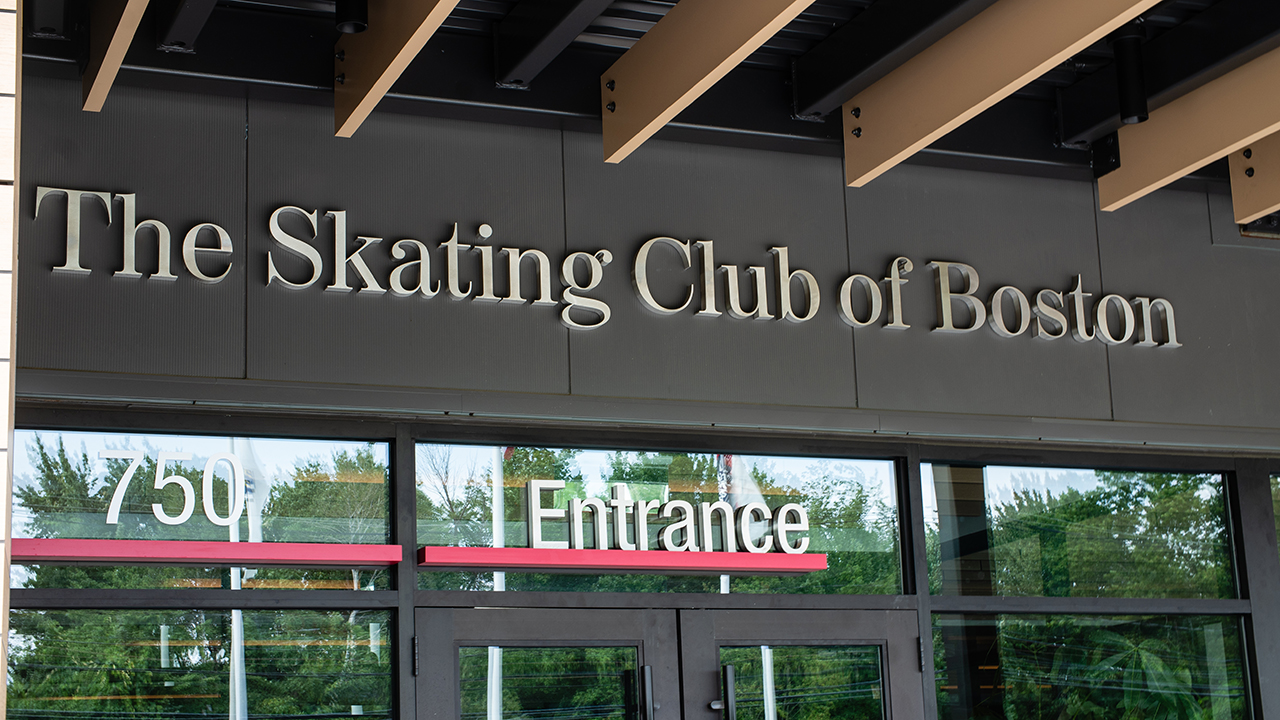
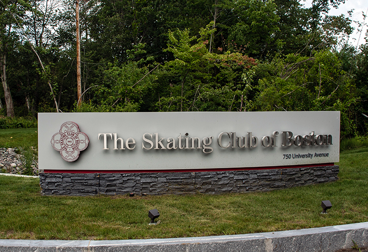
If you’re like some of us at LLM Design, you can still remember when you wanted your hair cut like Dorothy Hammil or watched Michelle Kwan and Tara Lapinski go toe loop to toe loop in the ‘98 Olympics with awe and amazement. Home to Tenley Albright, the first American Olympic gold medalist and many groundbreaking skating programs, Boston has always had a rich history of figure skating. The Skating Club of Boston, established in 1912, is the third oldest skating club in continuous existence in US Figure Skating, as well as a founding member of the U.S. Figure Skating Association. The Club has now embarked on the next generation (thenext100years.org) of the sport, beginning with a new state-of-the-art facility located in Norwood, MA and beautifully designed by Studio Troika.
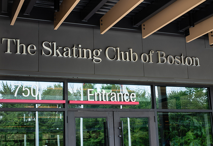
LLM Design’s role in the project was to thread the history and tradition of the Club’s brand into a contemporary environmental graphics, signage and wayfinding system for the new facility. Our approach was to integrate the brand and the environmental graphics into the new structure and architecture with energy, clarity, and continuity. Many audiences will call the new facility their home – and that brings the challenge of orchestrating family-friendly visuals and large venue wayfinding fused with historic archives into the theatre of the professional world of figure skating. No small task, but one we have loved.

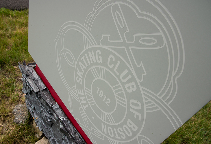
To achieve the continuity we needed, our designers found inspiration in the simple, yet effective, design element of the line. Its familiar form is easily understood by a variety of audiences and is a natural aid to wayfinding. Lines also have a direct connection to figure skating as the precision of lines and marks traced on the ice during compulsory figures was a critical component of early figure skating. In fact, the Skating Club of Boston’s logo was designed to represent these compulsory figure circles and lines.
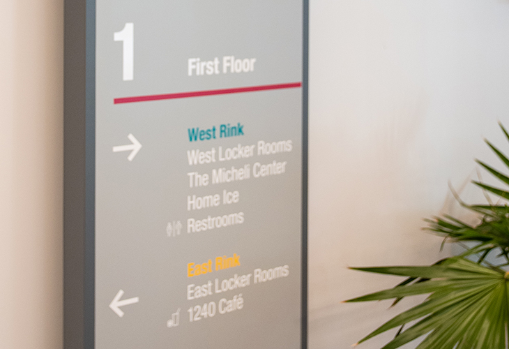
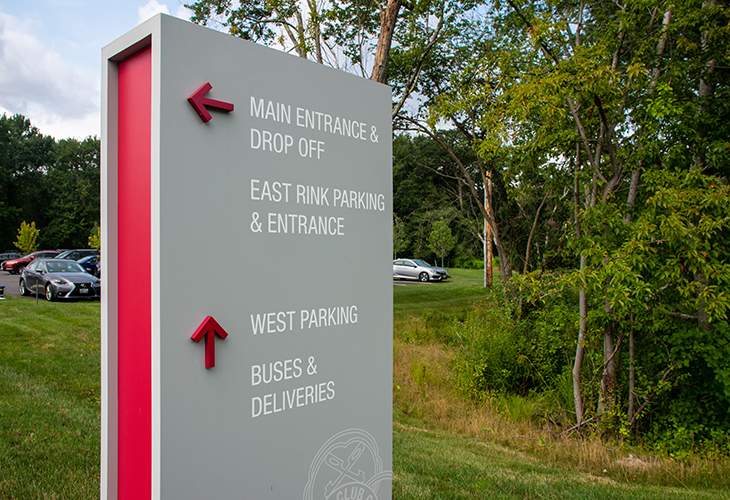
We used the line element as a continuous theme in the signage and graphics to connect all the pieces in this comprehensive system. From the ticket booth to the locker room, rinks and cafe, the line connects not only the signage system, but also The Skating Club of Boston’s brand to the new facility. We evolved this concept of the compulsory figure lines into our environmental graphics and signage design by creating, through use of a variety of materials, a dimensionality and movement to the line. Just as the compulsory figures evolved over time in response to the popularity of free skating, so too does our line as it weaves through the facility’s signage and graphics.
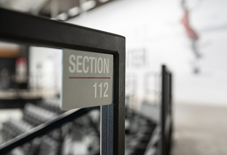
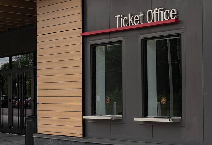
As we applied this design element to interior and exterior signage, the line changes shape and form to respond to each sign’s material and intentions. From cut red vinyl on Rink walls to painted metal aluminum at the Ticket Office and plexi elements on the History Wall, we were able to create a dynamic system with texture and dimension.
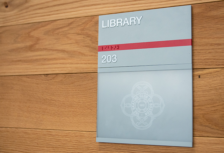
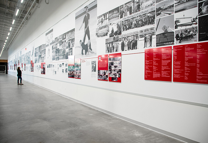
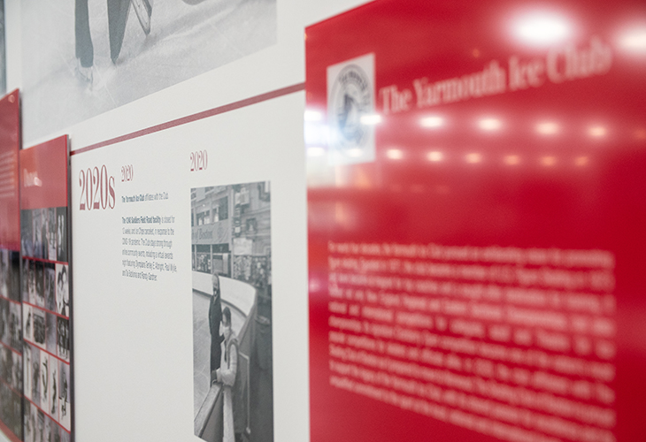
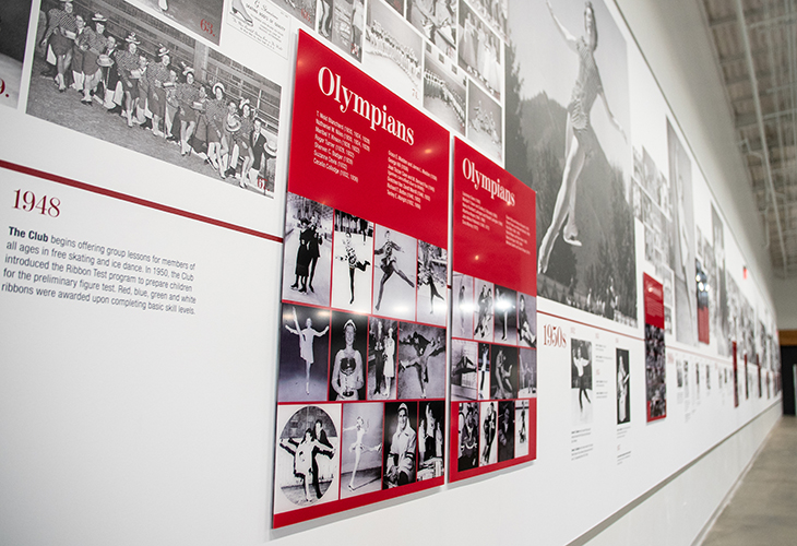
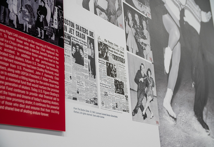
The Skating Club of Boston has an impressive history and heritage as the third oldest skating club in continuous existence in US Figure Skating. To symbolize this great lineage of skating families and members, we applied the line as the element of continuity in the panels of the comprehensive History Wall. Plexi panels add dimension to the 2D vinyl elements to create an overall feel of depth and dimension.
The line is one of the most essential elements of design. When implemented with artistic vision, this simplest of design elements can have the greatest of impacts.